Design at home with the cricketeers
Color is everywhere we look. From the minute we open our eyes in the morning and peer into the deep chocolate brown of our coffee, to the golden amber of sunset, and mysterious black of night when we close our eyes.
How do we make sense of it all? Color theory is the science and art of using color; explaining how humans perceive color, and how colors mix, match, and contrast visually. Colors are organized on a color wheel, to show the relationships between them, and are grouped into three categories:
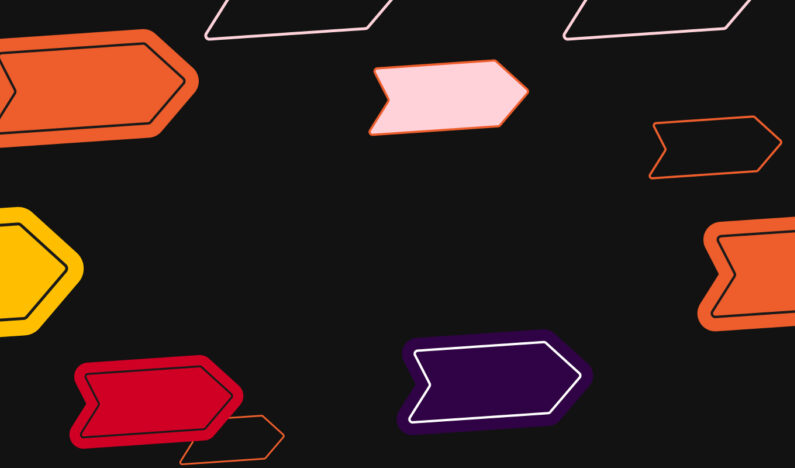
- Primary colors are colors that you can’t create by combining other colors together: red, yellow, and blue.
- Secondary colors are colors created by combining any two primary colors.
- Tertiary colors are colors created by mixing a primary color with a secondary color.

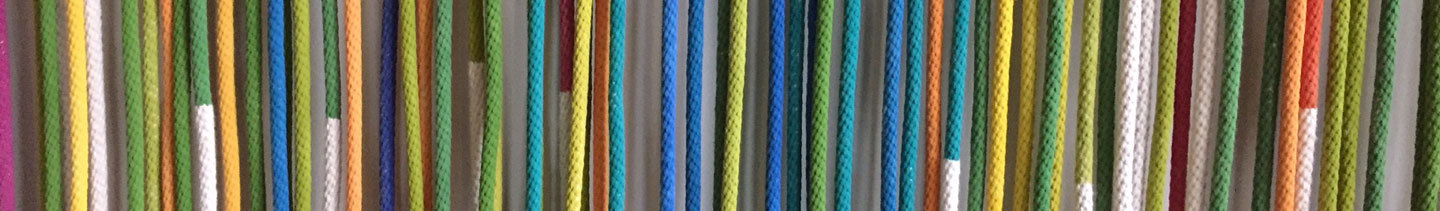
We all know there are more colors than primary, secondary, and tertiary, though. Thousands? Millions? Infinite? Some say there are 7 million colors our eyes can perceive, others say 10 million. Color perception changes based on lighting conditions, not to mention one person’s “blue” might look like a different blue to another person’s eye. These variations are accounted for by different levels of black and white, which you can mix to create different tones. Every color can be described using attributes of hue (pure color), brightness (tint or shade), and saturation (tone).
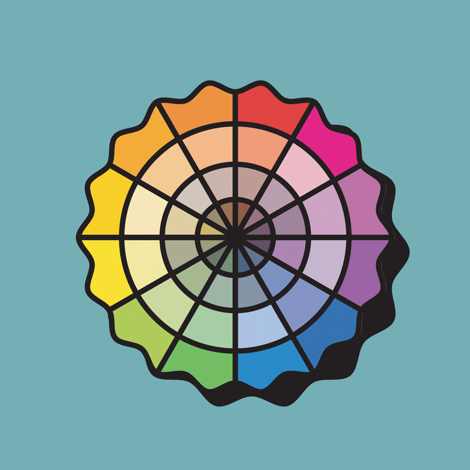
Now that we’ve gotten the colors organized, it’s time to think about how colors relate to each other. When you put a color next to another color, your brain sees them together instead of separately and does some brain magic. The color of the middle triangles in this graphic is the same, yet looks different (softer or brighter) when paired with different contrasting colors.

So, why does this matter? Studies have shown that color influences human behavior, including perceptions such as the taste of food, the effectiveness of placebos, and can cause different emotions. Think about the colors of M&Ms, many people believe brown ones taste different than green ones.
Due to this psychology of color, it has a lot of effect on how we understand the idea behind visual things — like book covers, paintings, logos and visual identities, netflix show intro sequences, etc. Color can communicate many different things in different contexts. Red whets our appetite and gets us excited, while blue is calming and says things are serious and stable.
Color pairings that are analogous (next to each other on the color wheel, e.g. blue+bluegreen+green) are more soothing and harmonious, while color pairings that are complementary (across from each other on the color wheel, e.g. red+green, or yellow+purple) are more active and vibrant. Colors combinations that are more muted can feel more retro, and color combinations with a lot of contrast can feel more contemporary. Ever notice how Wes Anderson movies have a retro, quirky feeling to them? He’s got a genre of color palette that most of his movies fall into. Choosing a color palette isn’t always about what you like, it’s about what you want your end product to feel like, and what you want people to feel when they interact with it.
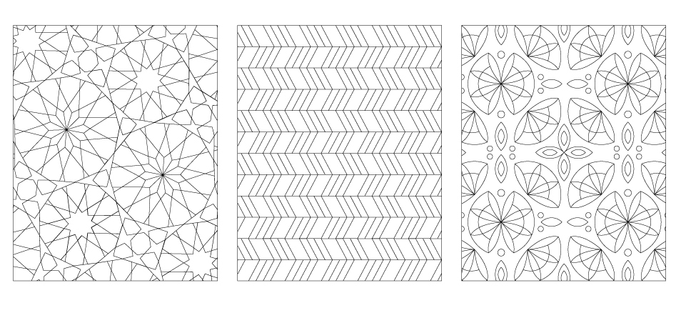
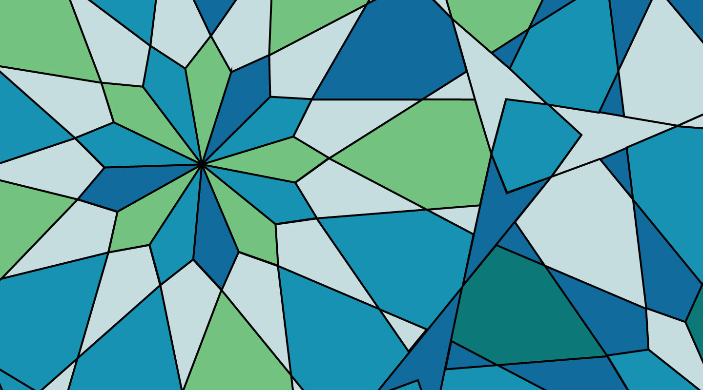
Now for the fun! We’ve designed three different coloring pages for you to download and print at home – try coming up with a feeling that you want to convey, and then pick 3-4 colors in a color palette that communicates that feeling. Then choose a different feeling, and a color palette to support that one.
Out of coloring pencils or pens? Feel free to participate some other way! If you have design software, design 3 different color palettes for 3 different feelings. Maybe play around with an unusual to display your palettes! Or come up with your own color exercise! We'd love to hear about it.
Share your projects on instagram with #cdwdesignathome to enter for a chance to win a prize, and to see what others come up with! Or keep them to yourself, that's cool too! We hope you have fun with color!
