A brand that stands the test of time
The Madison Library Foundation engaged Cricket Design Works to develop a new brand platform and visual identity for Madison’s public library in a time when competition for attention is more challenging than ever.
The Madison Library Foundation engaged Cricket Design Works to develop a new brand platform and visual identity for Madison’s public library in a time when competition for attention is more challenging than ever.


From one perspective, it's a stack of media you might find at the library; from another, it's a cairn to help explorers find their way. As libraries have evolved over the years we knew it was vital to show that a library is much more than books. Brandnew.com featured the logo as part of its annual international round-up of best logo redesigns in 2012. The logo endures a decade later.
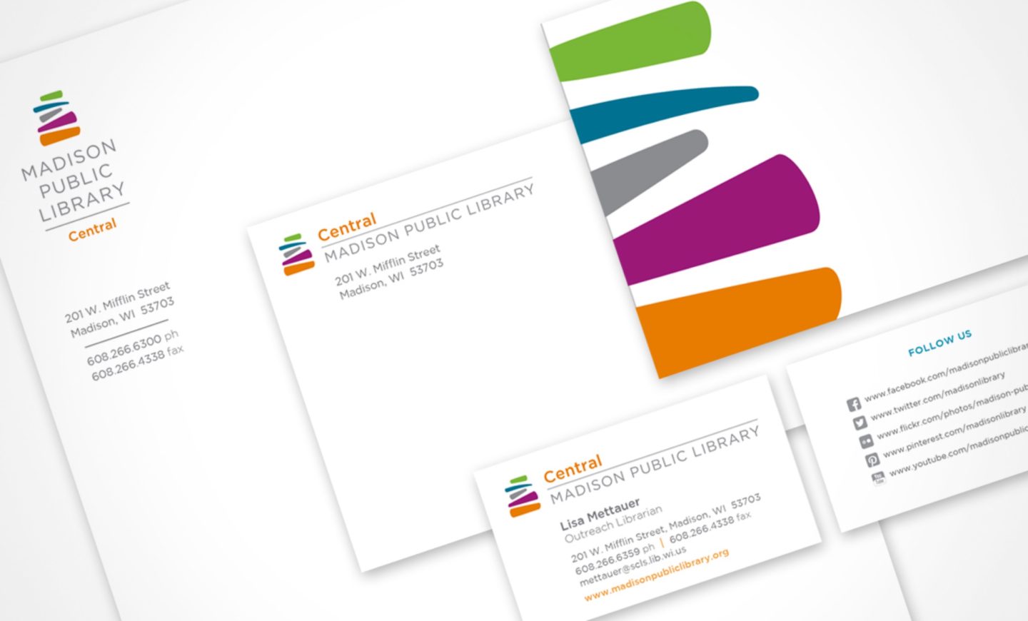
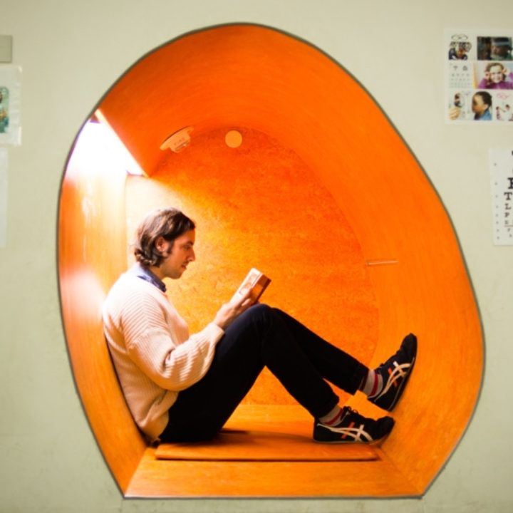
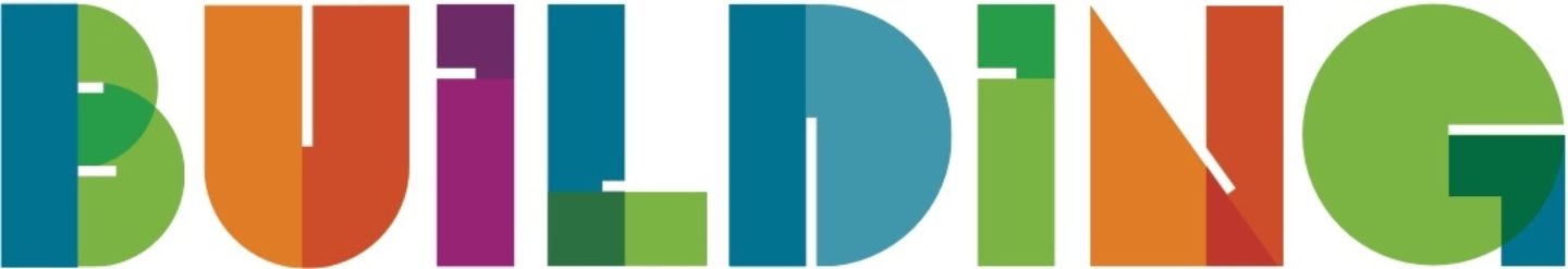
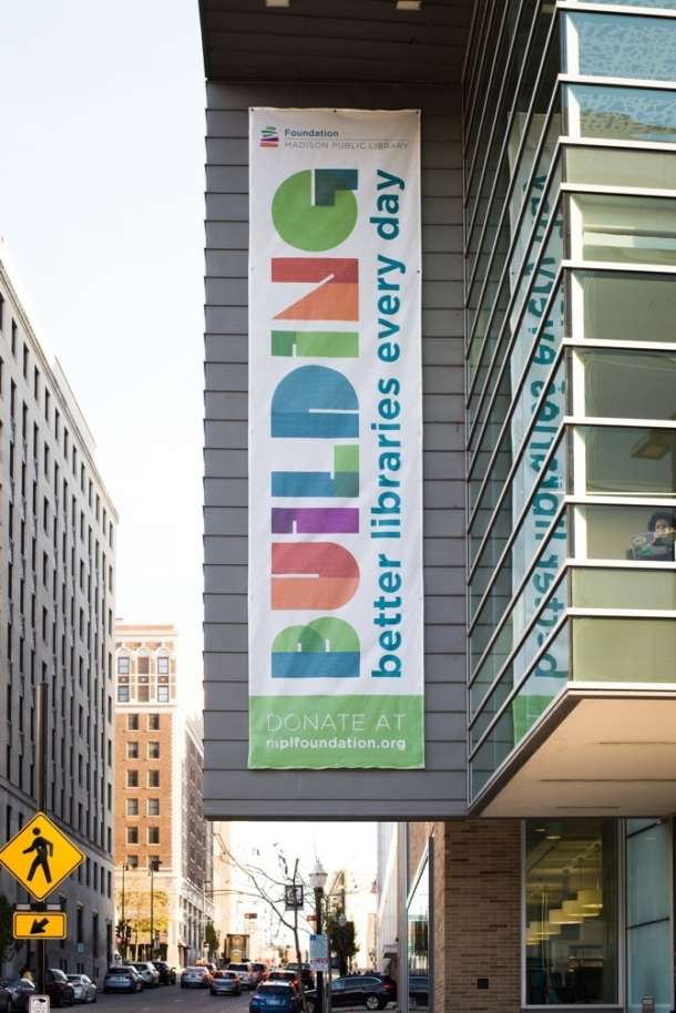
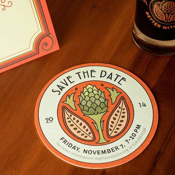
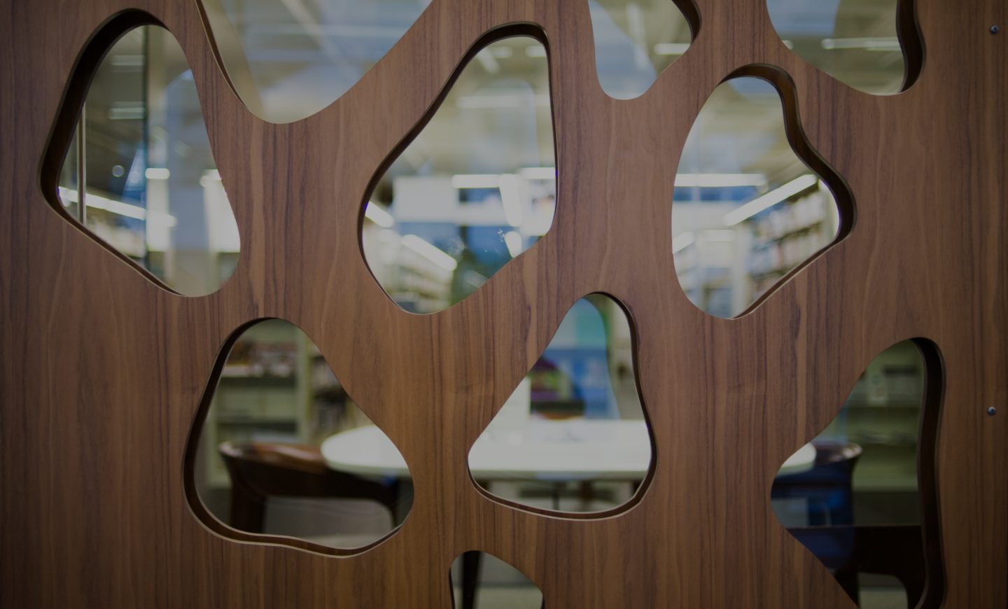
As part of this project, we developed two websites for the foundation and designed environmental signage, banners, print collateral, posters and event swag.
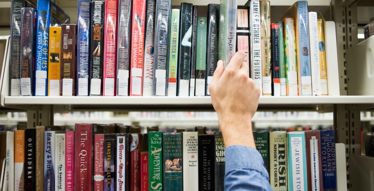
One of the most amazing things about reading is the endless number of worlds it can unlock for those curious enough to dig into a book. Literature can take on so many different meanings for different people. From escaping into a romance novel, to pondering the depths of the cosmos, to learning how to fix a refrigerator–there is truly something for everyone.
Michael Sambar
Senior Designer

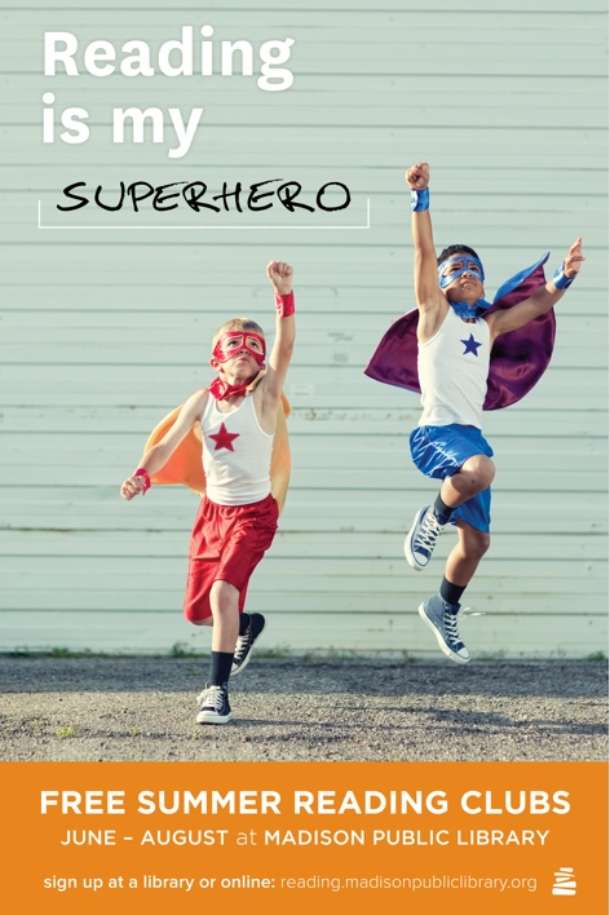
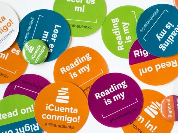
Our campaign for Madison Public Library's Summer Reading Programs was designed to evoke the sense of wonder and exploration that literacy provides for an audience of English language learners and their families.
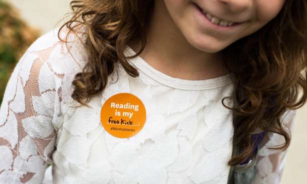
The collateral for this three-month campaign included a broad range of materials: print ads, stickers, pins, bookmarks, large-scale city bus ads, posters, animated gifs and radio advertising in multiple languages.

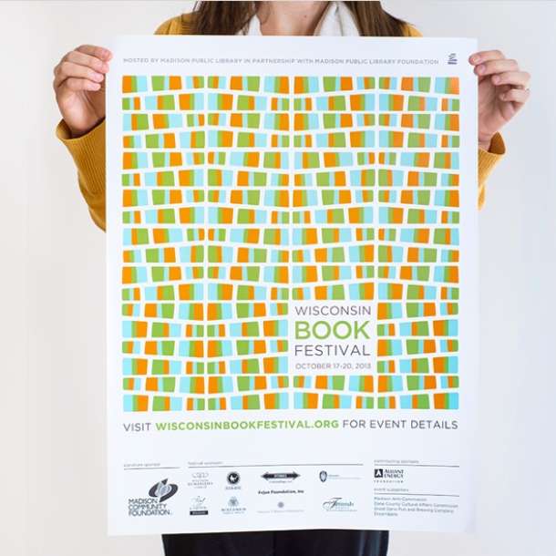
Cricket Design Works also updated the brand identity for the Wisconsin Book Festival to become part of the library's brand family, including the website and all marketing materials.