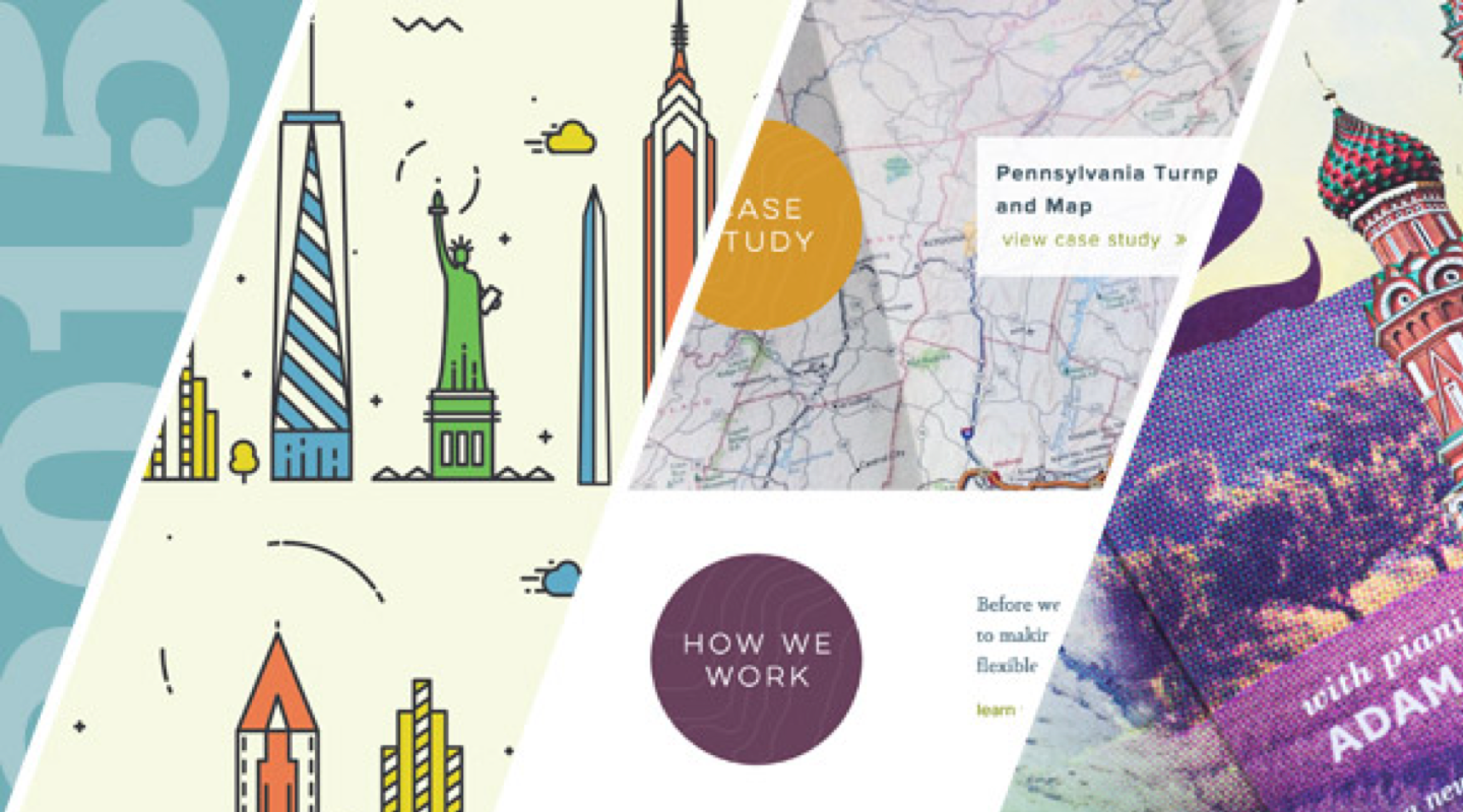
2015 was another year full of fun and challenging projects, growing together, and learning new things. We are so thankful for all of our clients for working together with us to bring forth work that we can all be proud of. We took a look back on some of our favorite projects from 2015, and we came up with a pretty wide range of faves. Check it out:
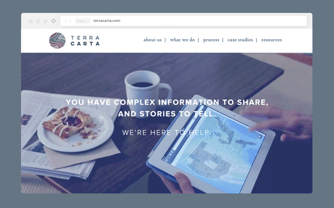
"My favorite project of 2015 was the Terra Carta logo and website project. The process as a whole involved a lot of new learning experiences that pushed me outside of my comfort zone, including a video shoot and interactive web animations. Throughout the project, the Terra Carta folks were very collaborative and open to many of the ideas we shared. Their mutual excitement about everything from an animated logo to photography and page designs helped keep the momentum of the project moving forward. I think there were also some serendipitous, "good luck" aspects to the project such as the typographic balance of the name "Terra Carta" and the easy access we had to a trove of beautiful maps and illustrations from the client's portfolio. To top it all off, the finished product felt new, functional and beautiful — and most everyone was happy with it. Bingo bango!" - Michael
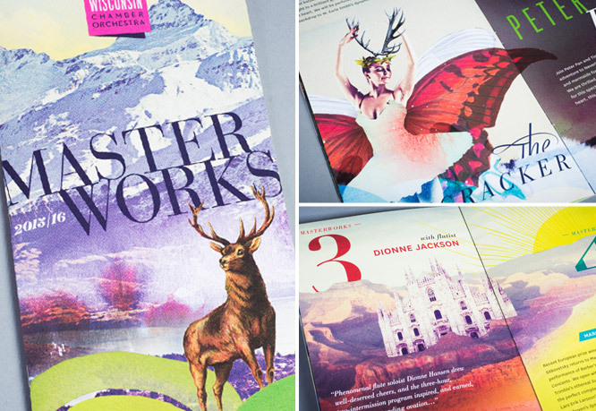
"The Subscribers Brochure for Wisconsin Chamber Orchestra's Masterworks series is always a lot of fun to work on. While it still presents itself as a design problem that needs solving, the folks at WCO give us a lot of creative freedom – I get to stretch my creative muscles into dreamy, surreal places and the illustrations at times feel closer to fine art." - Tracy
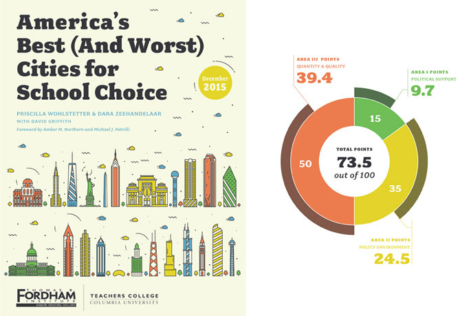
"My favorite project of 2015 was with one of our new clients, the Fordham Institute. I designed a report titled America’s Best (And Worst) Cities for School Choice. Sounds sexy? Yes. When it involves designing infographics for thirty schools… it’s real, REAL sexy. Couple that with a client that proofs everything down to the pixel, and you end up with 179 super-tight pages of 30 customized pie charts, 117 tables, and 90 numbers centered in circles. All color-coded. With perfectly aligned type. And only four rounds of edits. It makes me happy." - Bethany
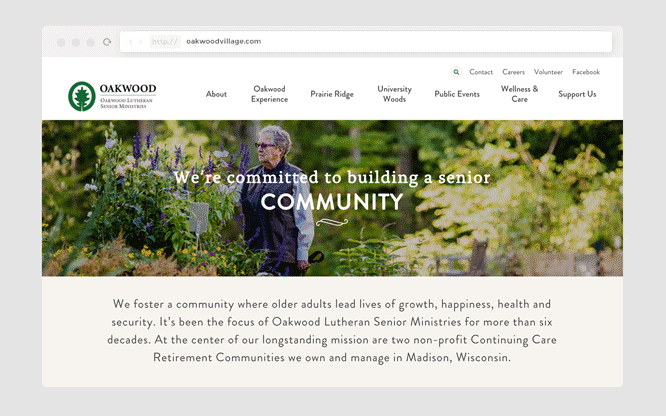
"Oakwood Village called on us to redesign their presence on the web. We recently updated their branding and I was excited to explore how that looks digitally. Our relationship with Oakwood is outstanding because they give us just the right amount of design freedom. With that flexibility, we created a site structure that uses new features that still speak to the right generation. Narayan and Tracy's beautiful photography was also a plus!" - Tessa
"The Oakwood Village website was a large project that provided the potential to vastly improve the user experience and access to content for Oakwood Village's website users. A keystone to the site was an extensive life enrichment calendar that provided an interesting development challenge." - Phil
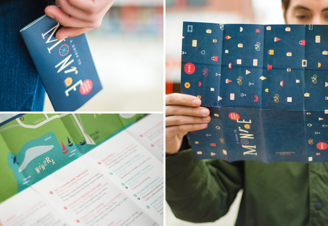
"The Monroe Street Dining Guide was my favorite project of 2015 because it was a very challenging, yet rewarding experience. For various reasons, the fold-out map was a work-in-progress for multiple years and always evolving, so it was a challenge to keep up with the new needs that this piece took on. With that, it became that much more satisfying to see it finally printed. I love that it is jam-packed with illustrations and rich colors and has the vibrancy to match the neighborhood." - Christina
"There are a bunch of projects that are favorites from the year. As Creative Director I get to touch so much and participate in so many different ways. I am particularly fond of Oakwood's new website because it was one of the larger sites we've built internally and I got to see Phil and Tessa stretch their skills and develop a site that's easy to use and is a huge improvement over past efforts.
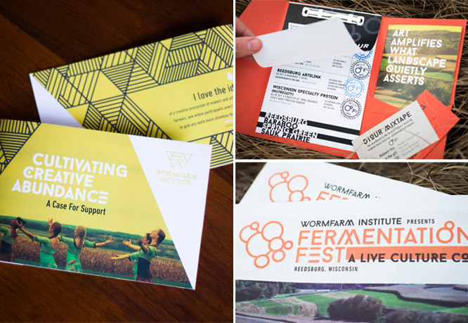
And then there's the rebrand that we did this year for Wormfarm Institute and Fermentation Fest. Wormfarm is an evolving laboratory of the arts and ecology and fertile ground for creative work and Fermentation Fest is a ten day convergence of agriculture, food, visual and performing arts. We had a great collaboration with the founders, staff and other designers to rebrand and produce all the marketing materials, new websites, passports for the DTour and swag all in a span of a few short months leading up to the Fest. See More
We also have been working on a product launch where we have been involved in the naming, product design, packaging, rollout and marketing plan. We have been involved since the beginning and the product is going to be amazing. We've had great synergy with this client and her trust in us has really blown us away and challenged us to go above and beyond to serve her evolving brand. The new brand will be rolling out in the first quarter of this year and we can't wait to share this news with you!" - Cricket