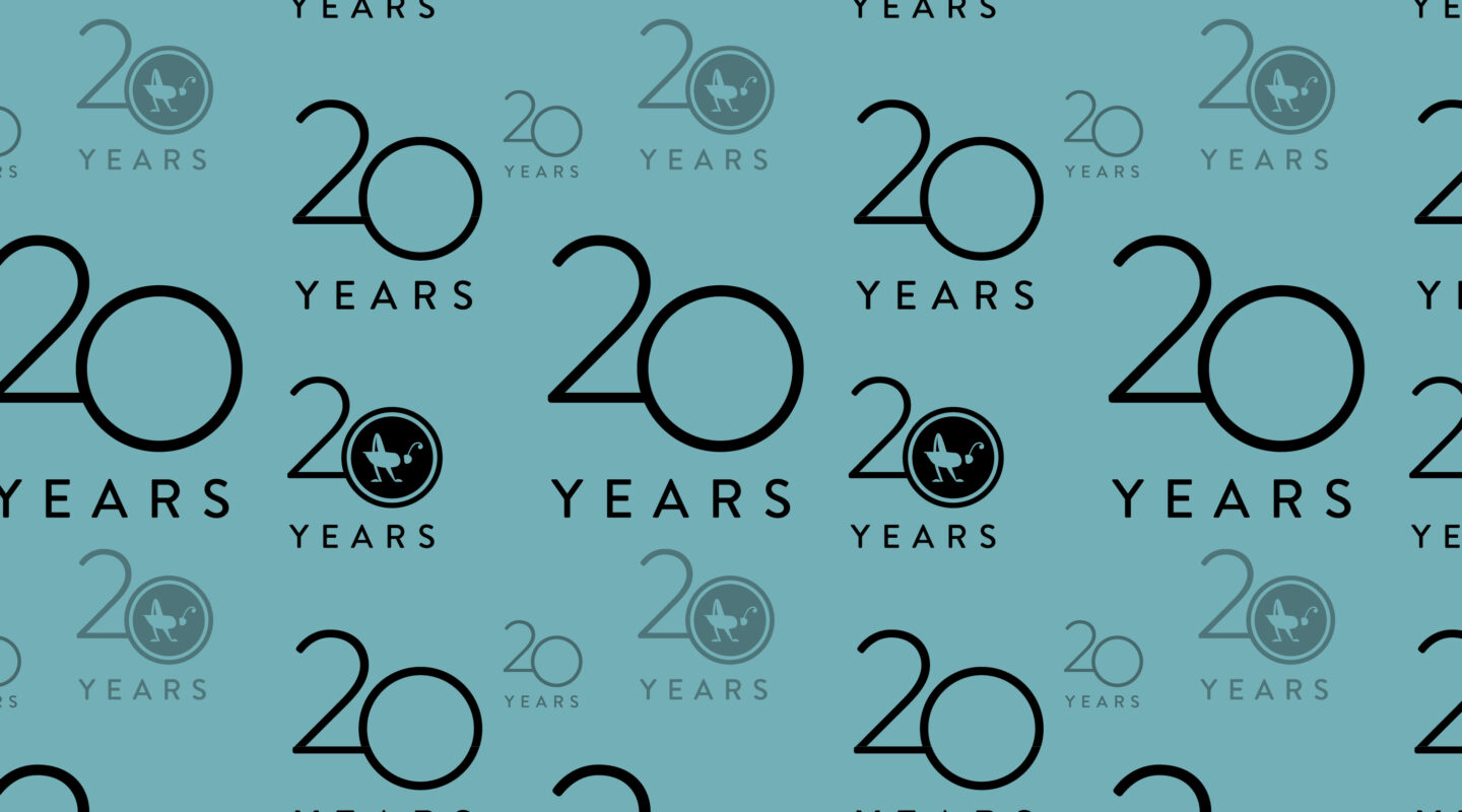
My, how time flies.
When our founder Cricket Redman first started the business in her spare bedroom back in 2002, Spiderman had just been released–with a very young Toby McGuire playing Peter Parker–and we wouldn’t see the first iPhone for another five years. Over the years we've always welcomed the opportunity to guide organizations through the branding process and created meaningful logos and visual identity systems that resonate with both the clients and their audiences. Our goal has always been to create something true to the brand more than something that is trendy in the moment.
We’ve been saying “right this way” for a couple decades now because we’re dedicated to human-centered design and building brands that people are drawn to. Through it all we’ve maintained that it’s a process, not a product. We've continued to build brands that connect with people and go the distance.
Here's a tour of some of our favorite logos through the years working back from the present:
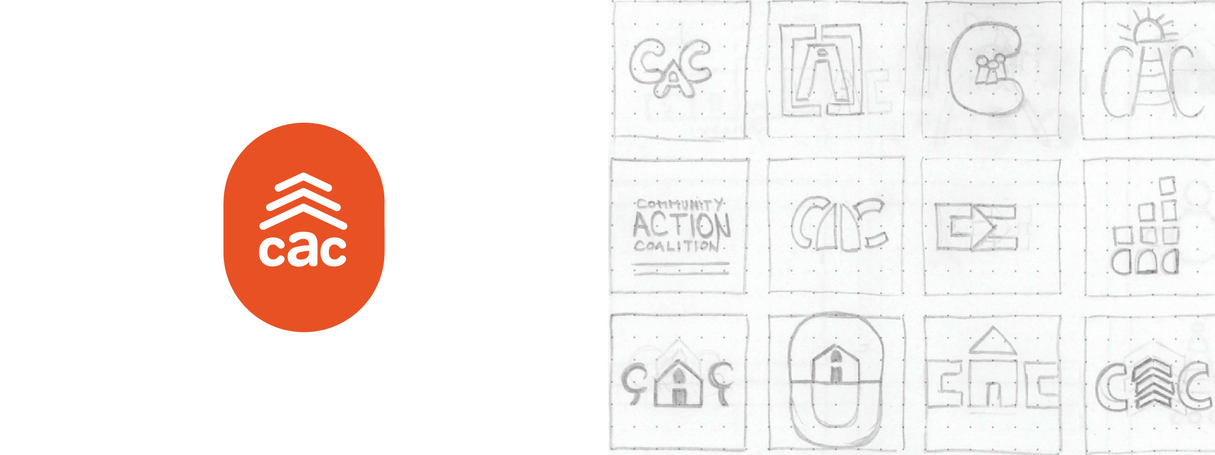
Community Action Coalition, 2021
This non-profit born from Johnson's War on Poverty (1964) was in dire need of a brand overhaul. CAC's previous mark was literally a cog, which is probably what it felt like to move through the machinery of this organization back in the day. New leadership brought us on board to bring the brand in line with organization's holistic approach to supporting its communities. CAC works in three southeast Wisconsin counties to provide people with a place to call home, as well as feed themselves and their families and secure the resources they need to thrive. The thumbprint shape represents collective strategies to every individual’s climb out of poverty.
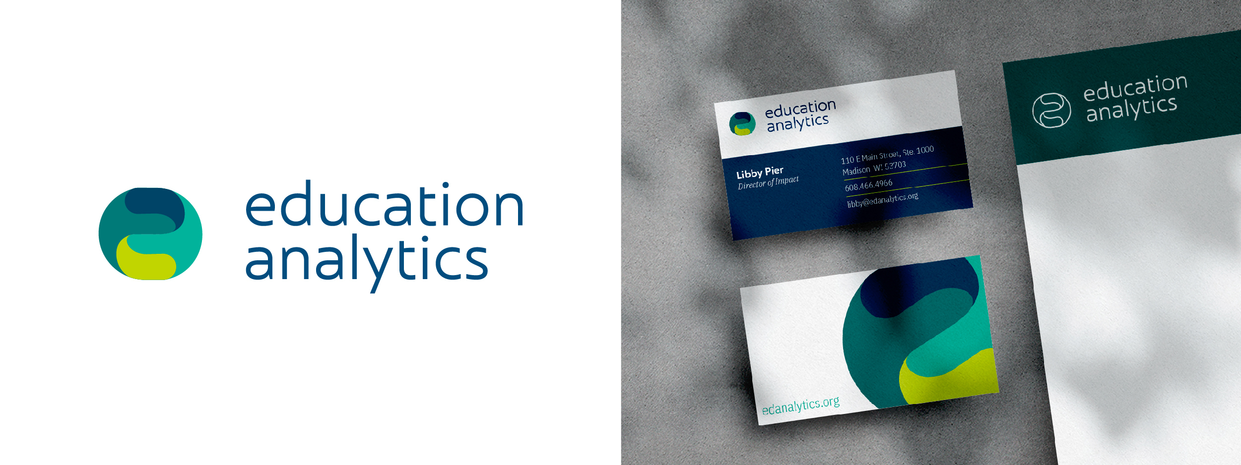
Education Analytics, 2021
At its simplest, an “e” and an “a”, this logo fits together like the research and analytics that reside at the core of the organization’s work. What’s more, it speaks to the collaborative way EA approaches every project.
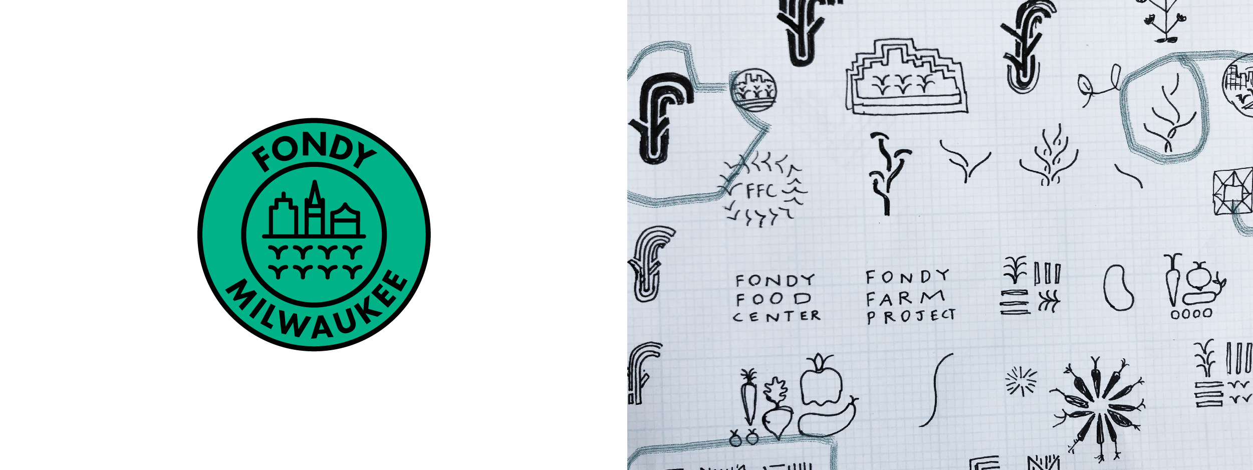
Fondy, 2021
Fondy occupies a unique space in Milwaukee’s food landscape, bringing locally grown produce to underserved neighborhoods. We conveyed this intersection by depicting a modern, geometric farmland and a cityscape that references Milwaukee’s skyline.
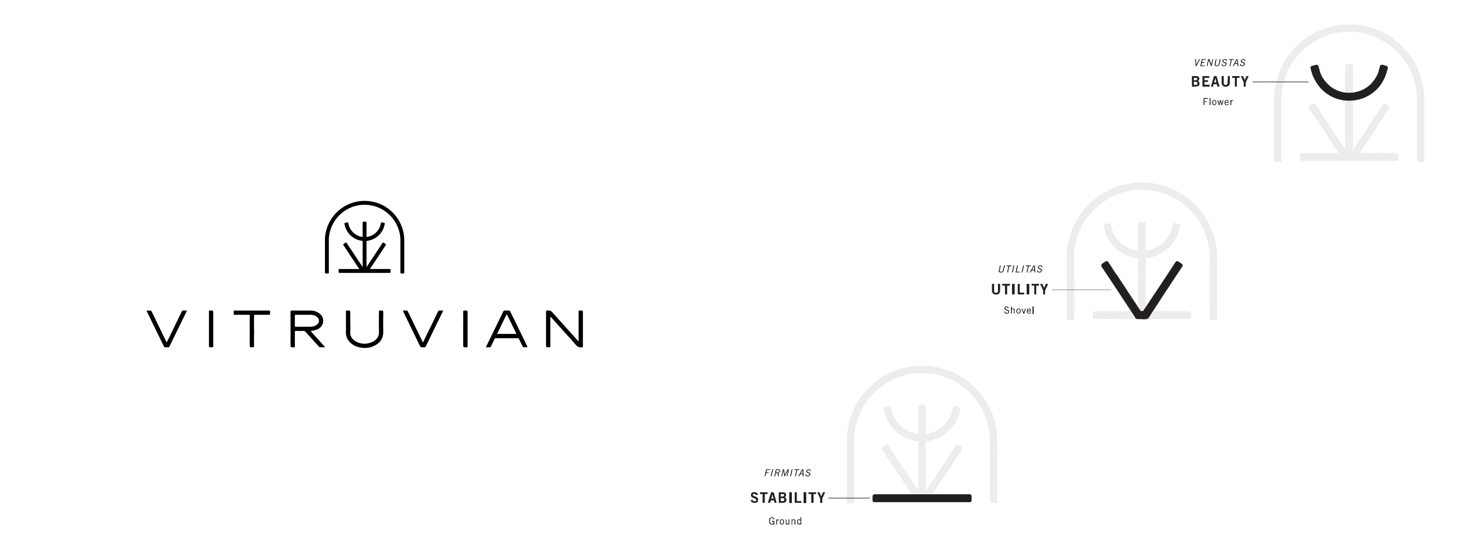
Vitruvian Farms, 2020
Stability. Utility. Beauty. The Vitruvian logo was inspired by this clear and elegant set of principles upheld by Roman architect Vitruvius.
“My favorite of all the logos I've made.” - Senior Designer Michael Sambar
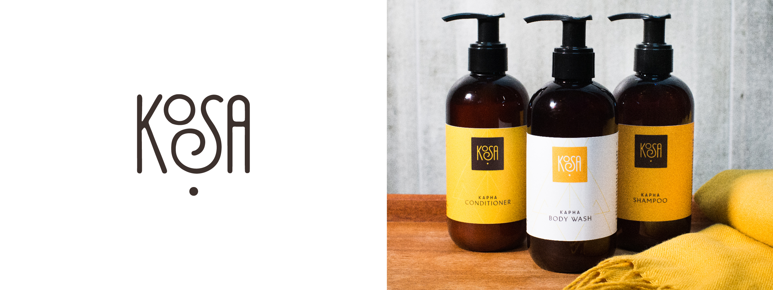
KOSA, 2019
Founder Shilpa Sankaran came to us with a vision for an Ayurvedic spa, but no name. She wanted something clean and contemporary that also represented an ancient method for wellness. We helped her name KOSA, and also created a hand-drawn wordmark and geometric visual system to reflect the ripples of wellness that come from caring for your body in balance with your true nature across the seasons.
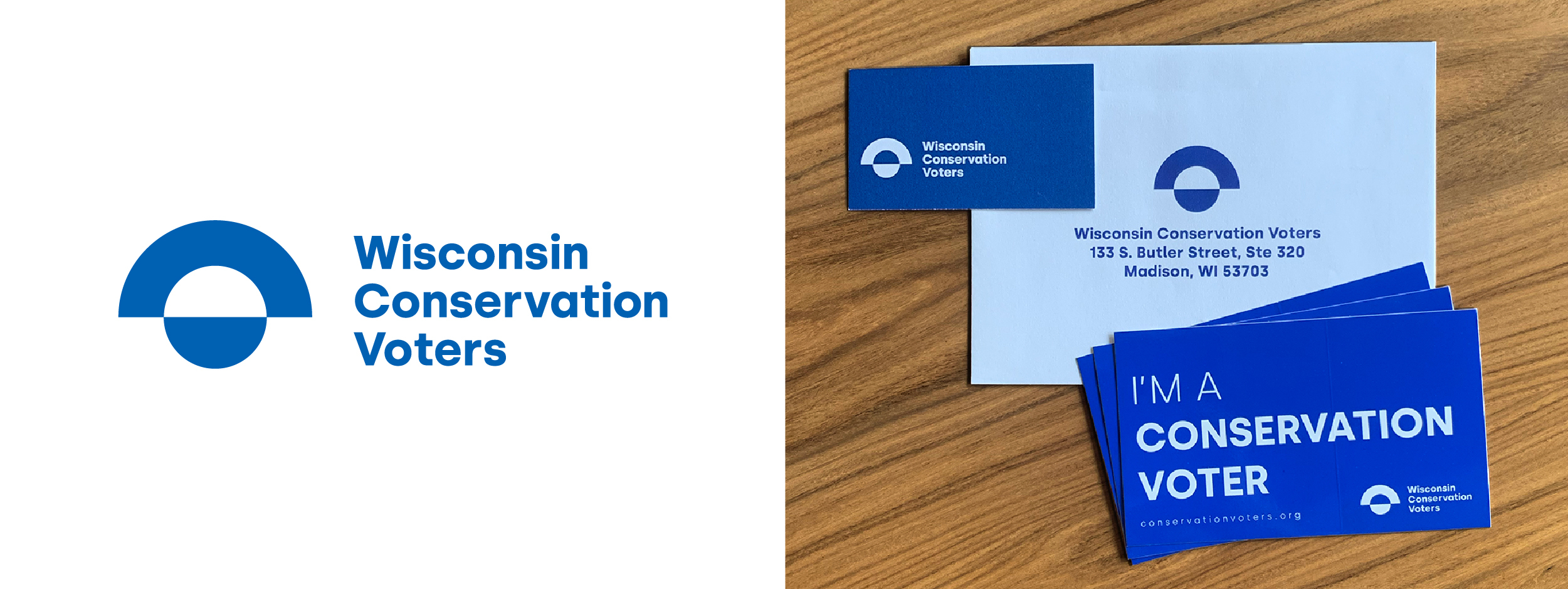
Wisconsin Conservation Voters, 2018
Wisconsin Conservation Voters keeps watch over legislation to help voters use their voice to advocate for conservation across the state. While WCV works to protect all aspects of environmental health, the organization has a particular emphasis on protecting Wisconsin's waterways. This strong and minimal mark represents both an eye and a body of water at sunrise.
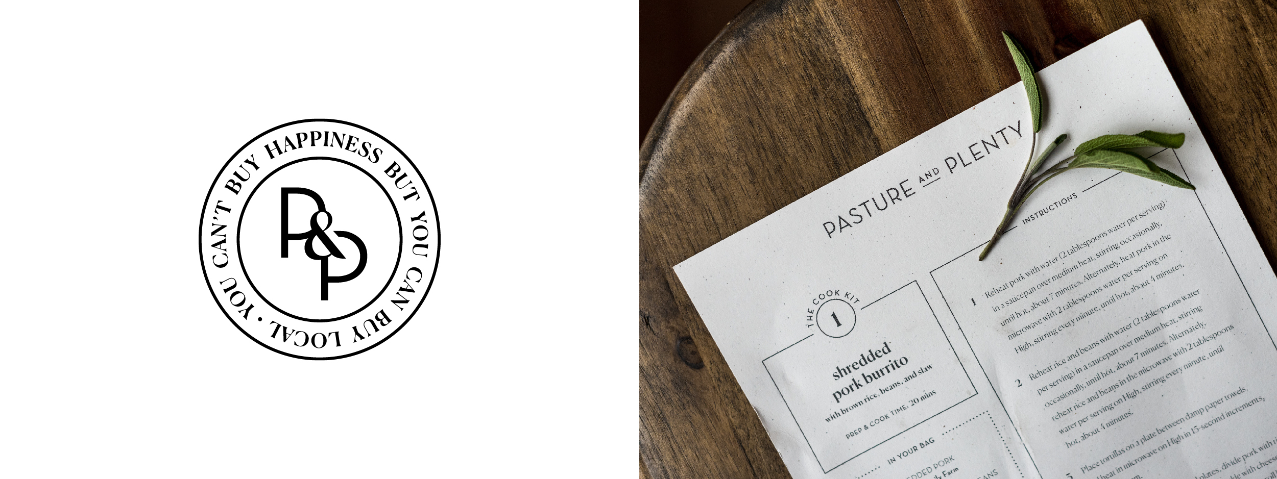
Pasture & Plenty, 2017
We named and branded Pasture & Plenty to fit owner Christy McKenzie's vision of providing high-quality, locally sourced foods to the community–and supporting our local food system in the process. While the vision and visual identity is straightforward, P&P has a unique business model that is part sustainable meal kit service, part cafe and part event and catering business. The mark is utilitarian, with a visual identity that's both contemporary and reminiscent of a time when people knew where their food came from.
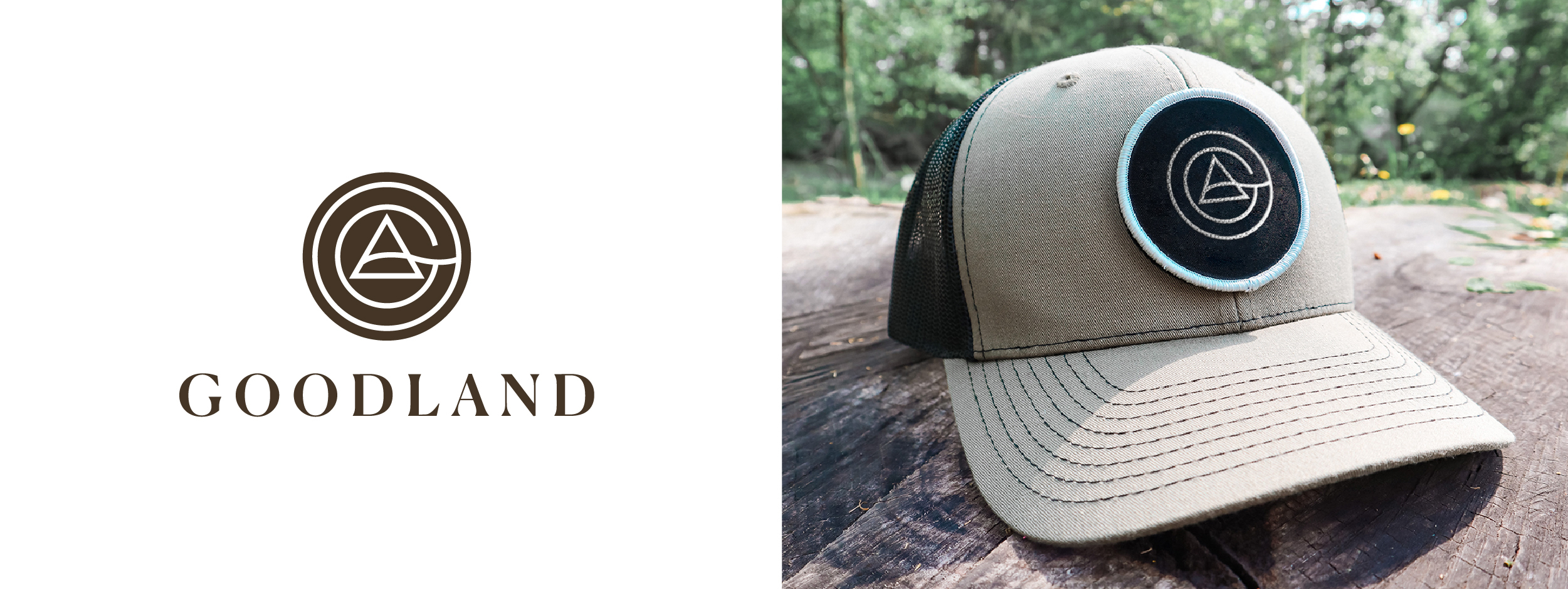
Goodland, 2016
Goodland works to build a more sustainable economy and a healthier planet by divesting from fossil fuels and reinvesting in renewables and green jobs. With a clean, balanced logo and a contemporary humanistic typeface, we captured the non-profit’s long-term vision.
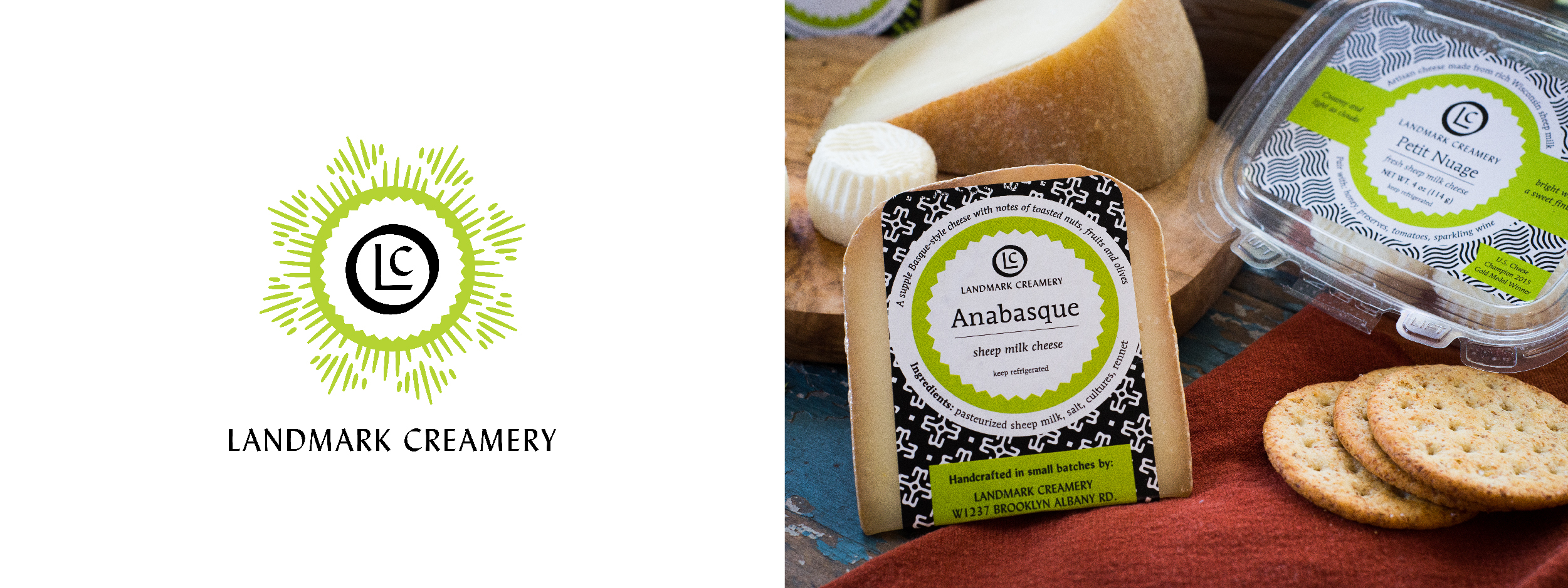
Landmark Creamery, 2016
Anna Landmark and Anna Thomas Bates make small-batch cheeses from grass-fed cow, goat and sheep milk that's sourced from local farmers. They wanted a visual identity that reflected the heritage of cheesemaking in Wisconsin, while maintaining a bright, bold and contemporary look. We delivered.
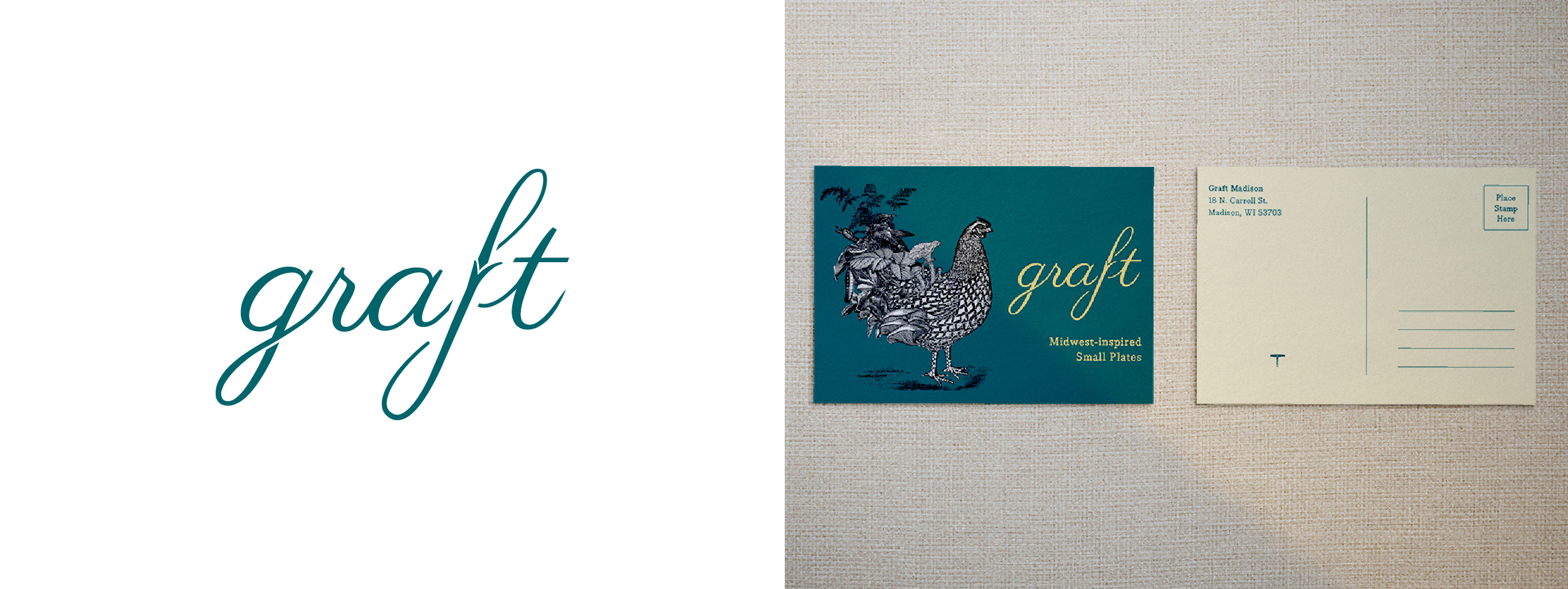
Graft, 2015
Inspired by the horticultural process of grafting–a technique used in vineyards to fuse the ends of two plants together–this logo captures the elegance and sophistication of wine, while illustrating the physical process of joining two stems.
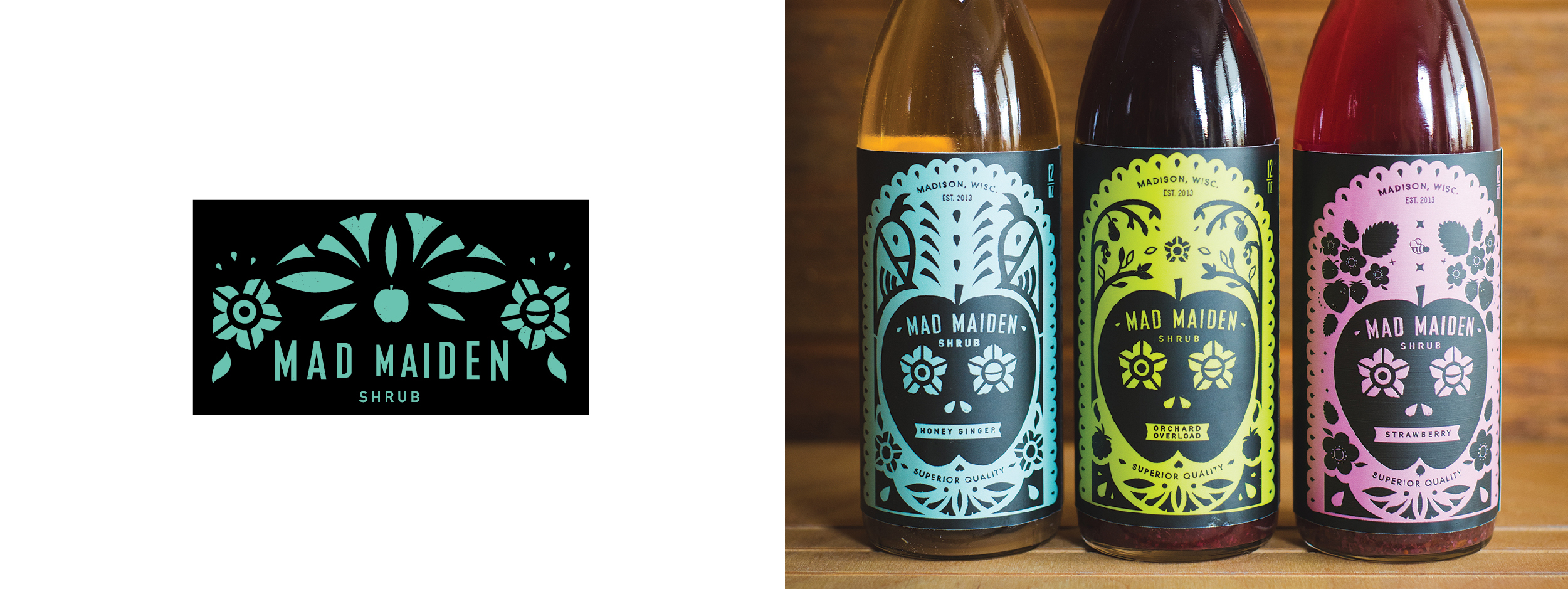
Mad Maiden Shrub, 2015
Back in 2015, old became new again. Shrub founder Janet Chen was interested in bringing this Colonial-era drinking vinegar to craft cocktails and mocktails. We offered her a quirky punk approach to a concentrated shrub: health-forward and made for mixing.
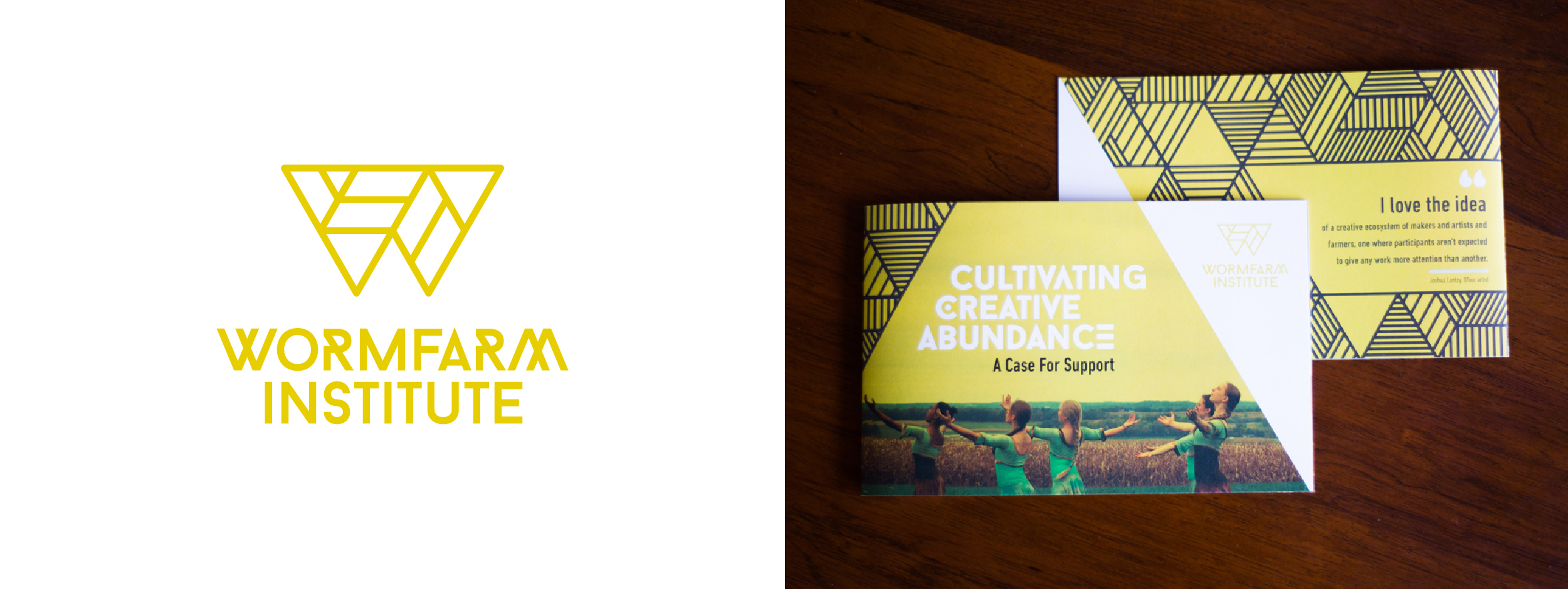
WormFarm Institute, 2015
WormFarm is a nationally recognized arts organization born when its founders left Chicago to live on a farm in the Driftless region. Seduced by life in the soil and struck by the parallels between farming and art making, they created an artist residency program and other events to celebrate the rural landscape and weave urban and rural culture together, much like earthworms. The modern, geometric mark is a contemporary take on rural farm landscapes, and fits within the visual realm of art and culture organizations.
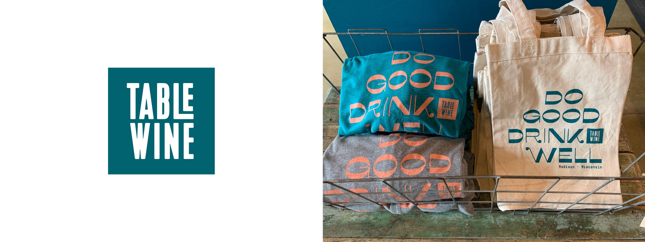
Table Wine, 2015
Approachable, humble and often effervescent, this local wine shop earned a logo that’s a toast to their personality.
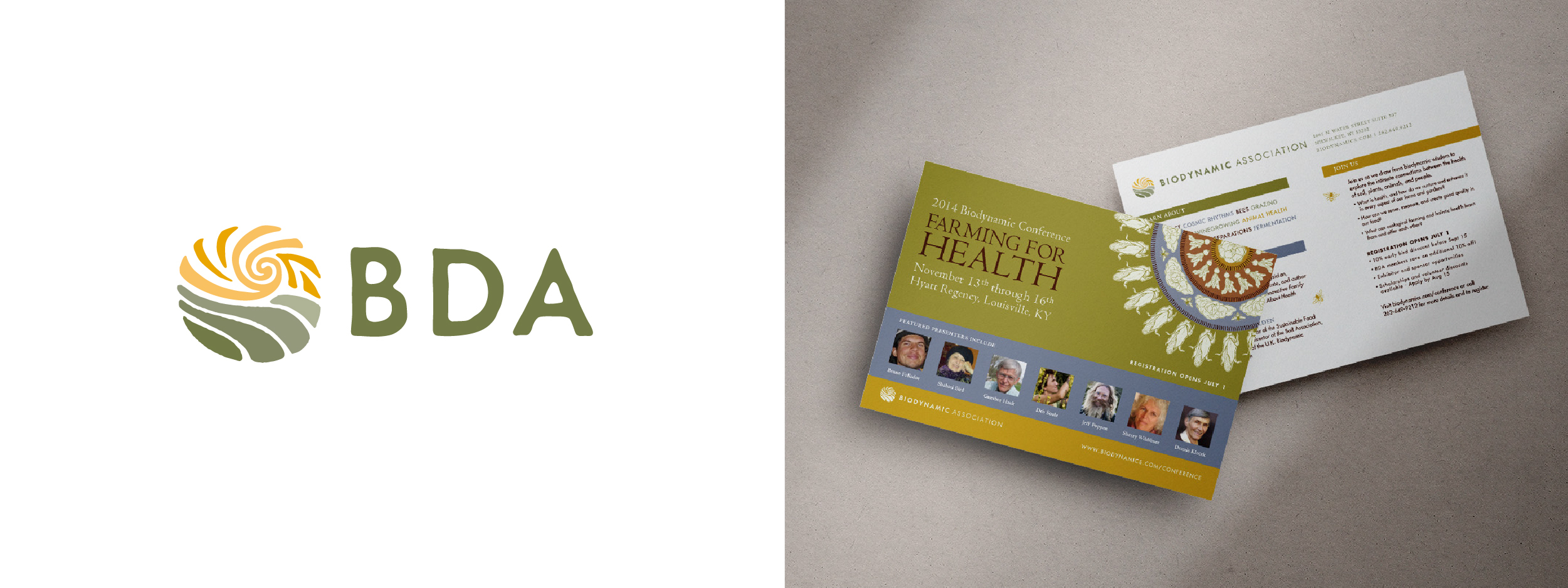
Biodynamic Association, 2013
The Biodynamic Association logo represents the core belief that nature acts as a unified whole, or a living being unto itself. The dynamic interplay between the sky and earth represents the flow of life energy and the interconnectedness of all beings.
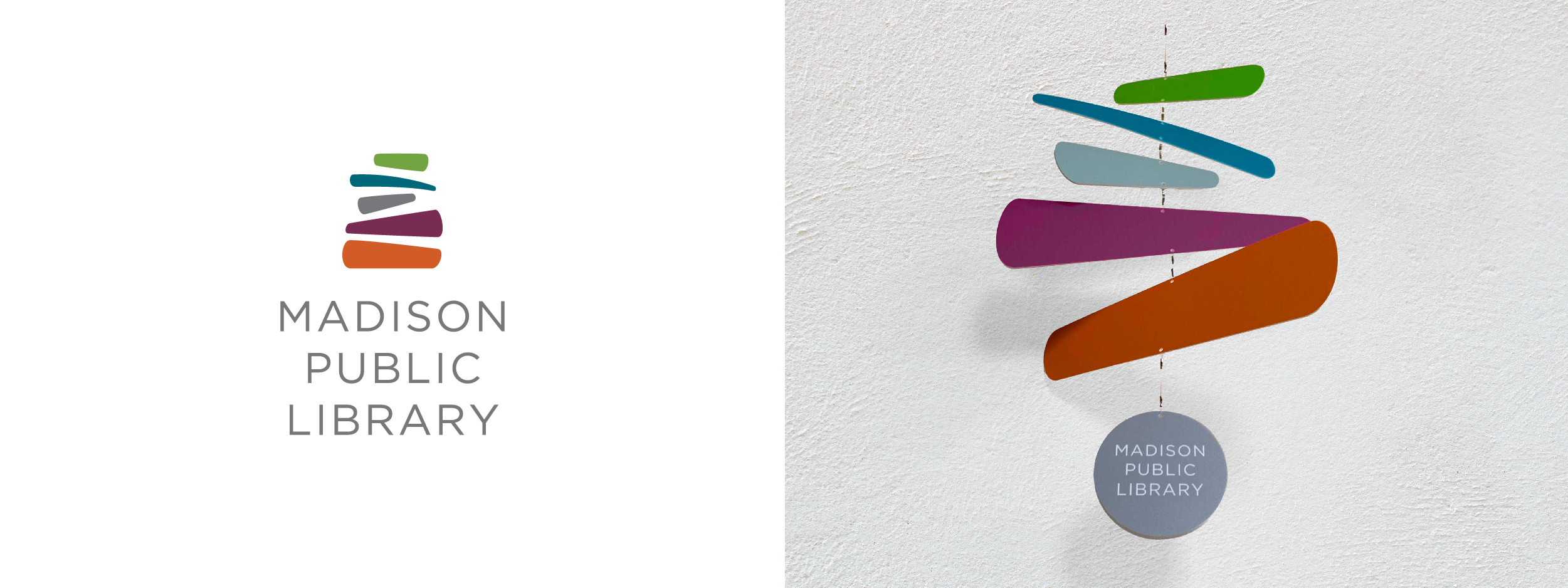
Madison Public Library, 2012
In step with building renovations, Madison Public Library embarked with us on a brand renovation at a time when libraries were repositioning themselves as destinations. The MPL mark acts as a cairn for those who seek. From toddlers coming for story time to retired folks gathering for a book group, MPL helps everyone navigate their reading journey. The logo also neatly doubles as a stack of media. It was recognized as one of 2012's Best Rebrands of the World by BrandNew and Underconsideration.
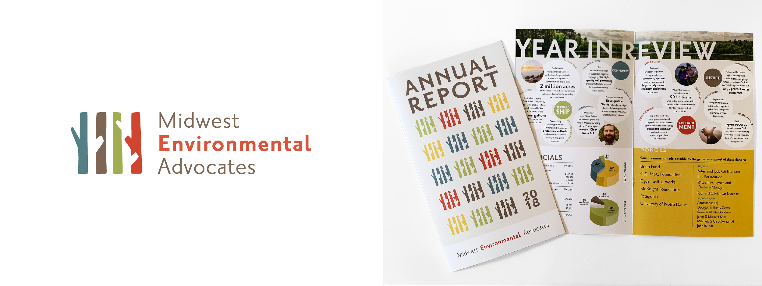
Midwest Environmental Advocates, 2010
MEA is a not-for-profit law firm with a vision of standing together to protect our region’s supply of surface water and groundwater, improve air and soil quality and steward the use of land. Like a stand of trees bordering a forest or windbreak, MEA's attorneys are determined to hold their ground.
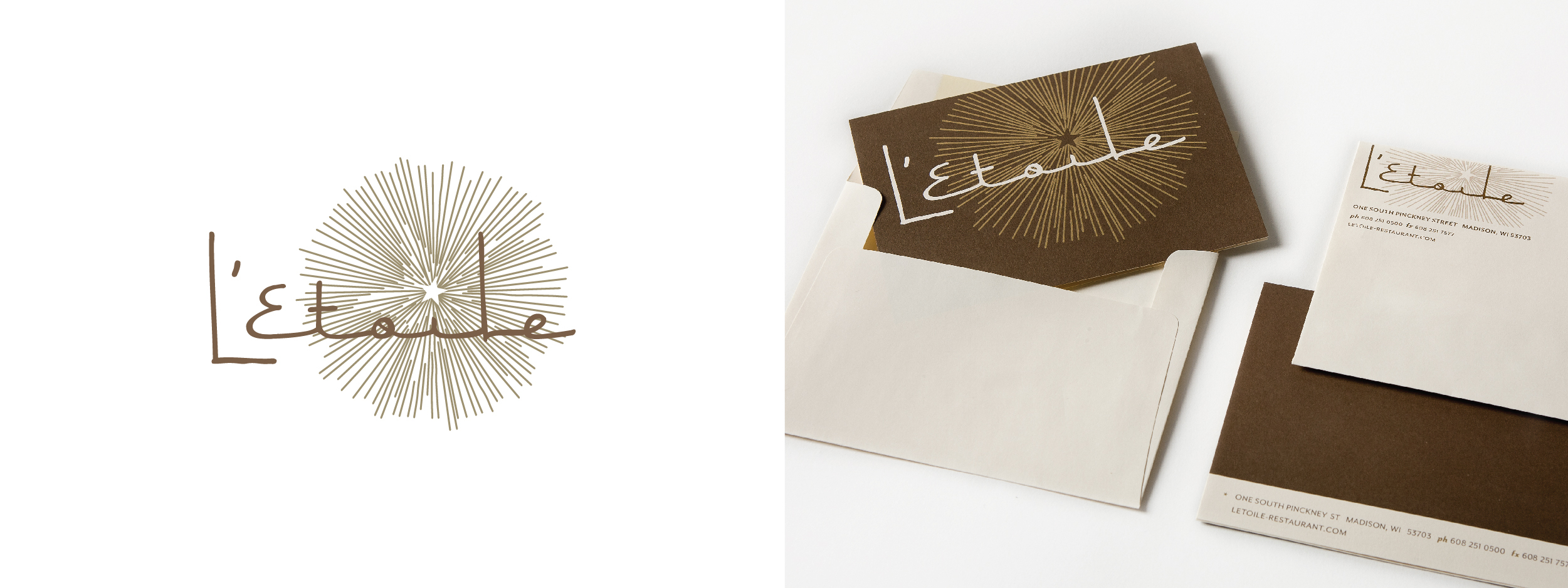
L'Etoile, 2008
When you eat at L’Etoile, fireworks happen. Following the transition from Chef Odessa Piper to Tory Miller, we updated their signature star-shaped umbels of dill and fennel into a more contemporary burst that reflects their new, contemporary location.
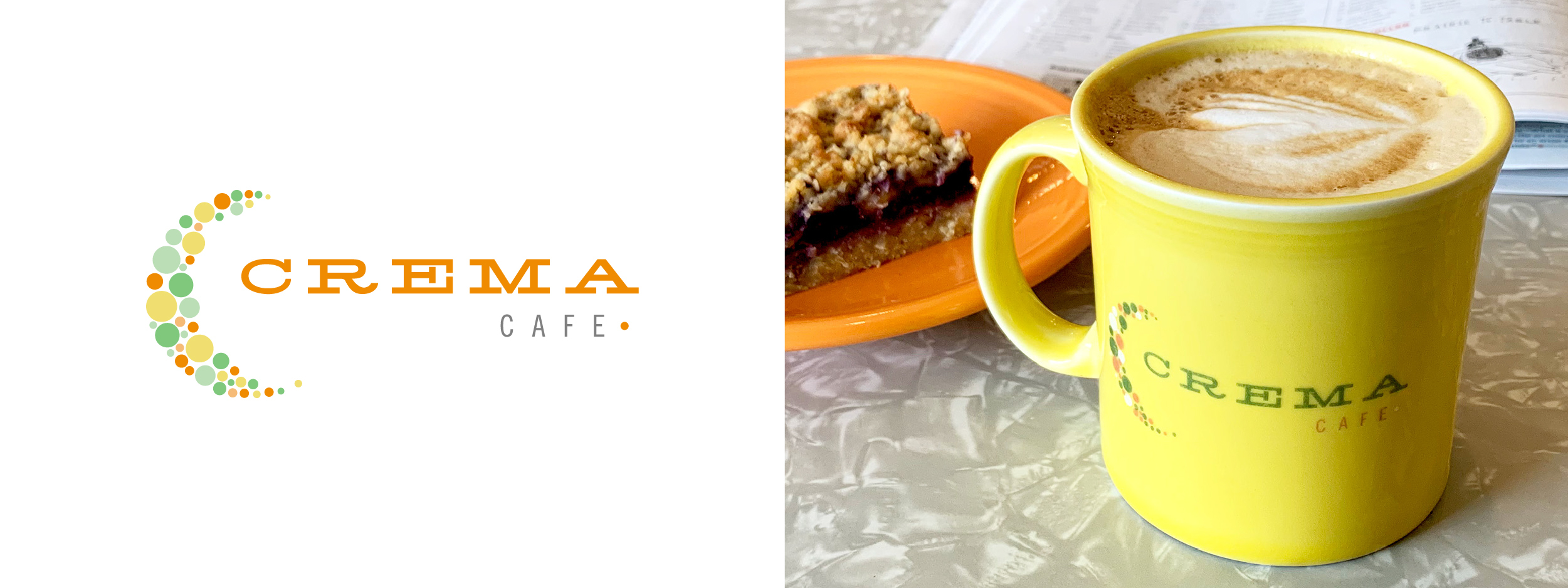
Crema Cafe, 2005
The owners of this Monona Cafe doubled down on their approach to quality espresso for breakfast and lunch, and we were there to build a visual identity that emphasizes the lively and casual atmosphere.
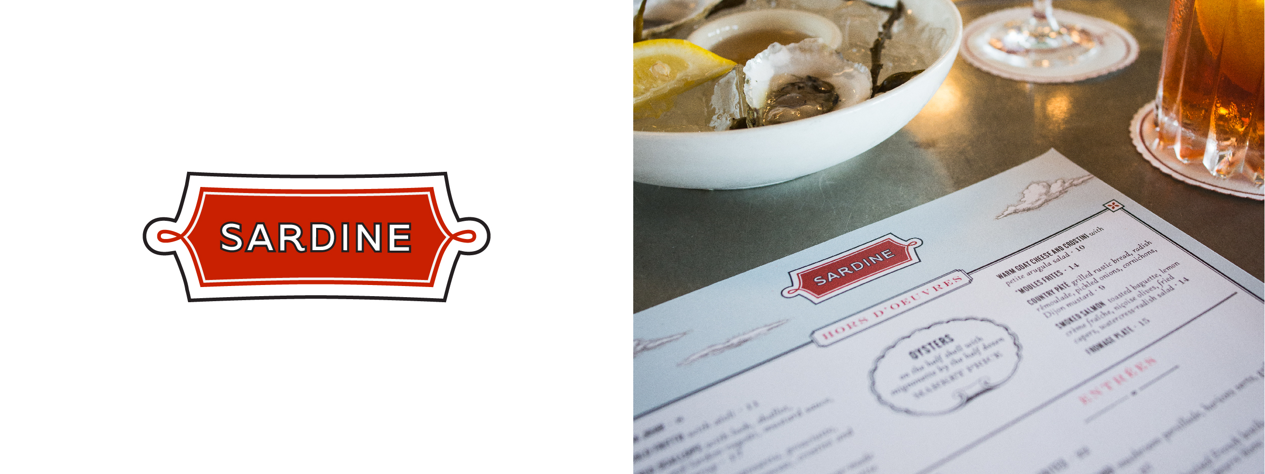
Sardine, 2004
Owners John Gadau and Phillip Hurley approached us with a concept for a classic Mediterranean bistro seen through the lens of a sustainability-focused locavore. They knew from the start it would be called Sardine. Whether or not you like the small herrings, this place and its coveted matchboxes have become a Madison landmark on the shores of Lake Monona.
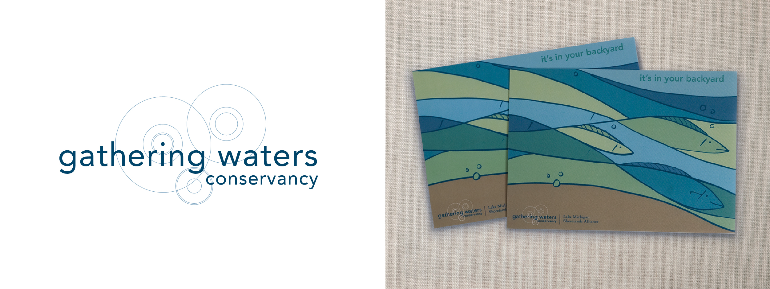
Gathering Waters Conservancy, 2003
This land trust advocacy organization protects the places that make Wisconsin special. We created a visual identity that shows the ripple effect Gathering Waters creates through their conservation support for landowners and land trusts.
Here's to 20 more.
As you can see, each and every logo has its own look and feel. We took great care to make them just that way. Year in and year out, we’ve held that it’s more about giving the client their own mark than it is about leaving our own.
Here’s to another 20 years of good work ahead.