CDWx Font Favorites: A Visual Guide
Find yourself confused by this type of jargon? Read up on our Typography Primer at the end of this post.
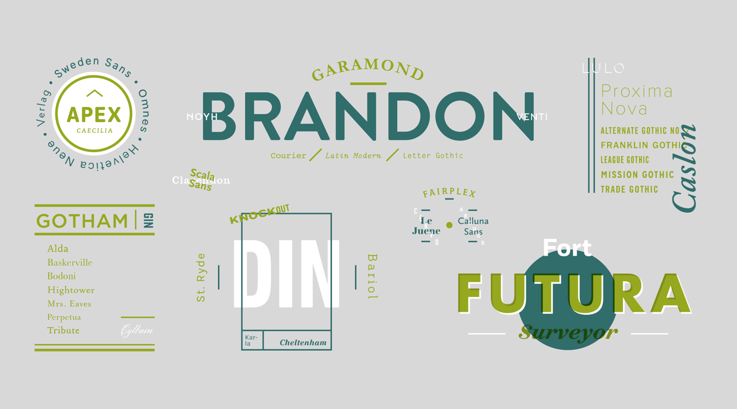
We polled the team at Cricket Design Works to find out which fonts rank among our favorites, and the results are in. Starting all the way back from Gutenberg’s revolutionary, moveable, blackletter type, through the revival of ancient Roman lettering, up to Humanism and the forward-thinking geometry of modern sans serifs, and the newest digital typefaces—designers today have an almost limitless number of choices, each with a unique voice and power to impact the meaning of a design. We buckled down, tallied up our votes and put together a type specimen-style infographic to showcase the winners in all their glory.
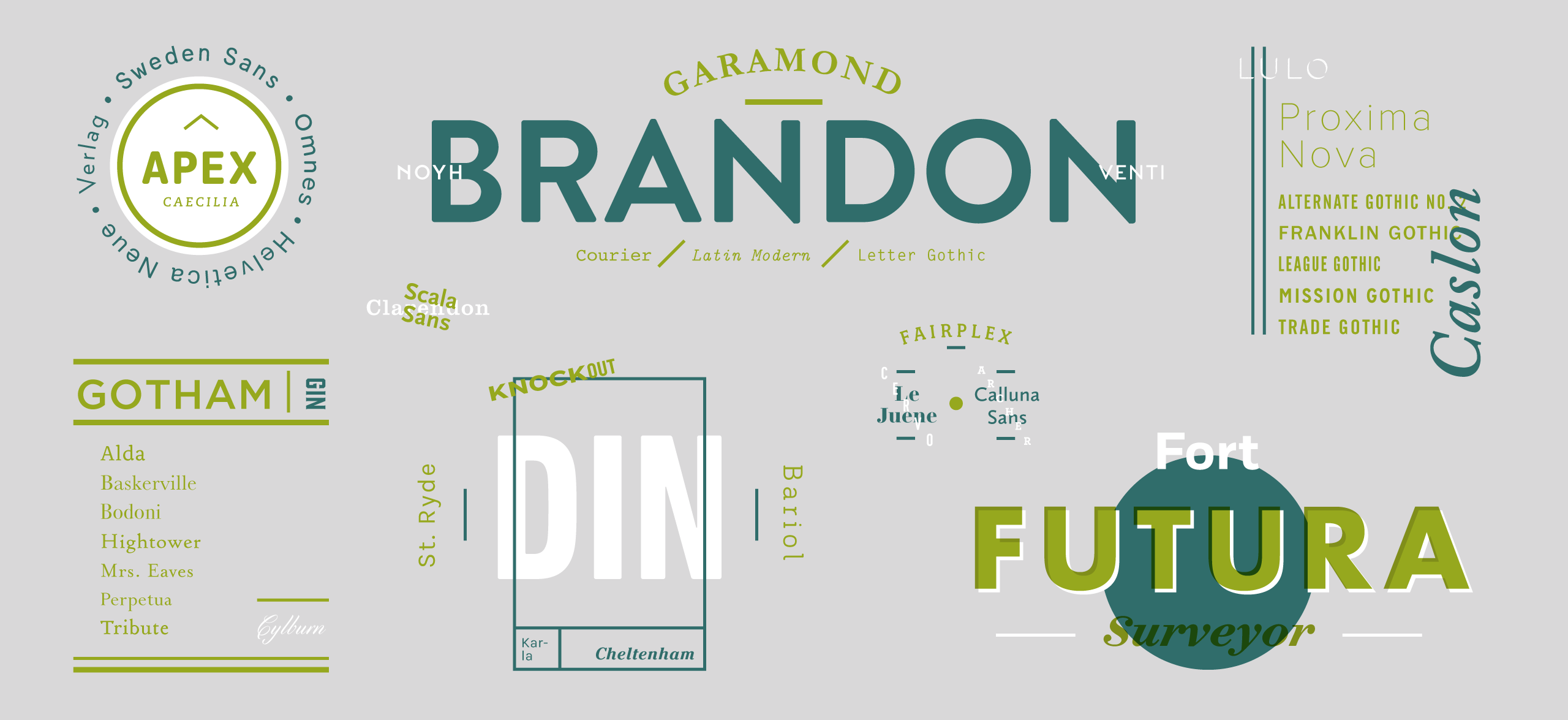
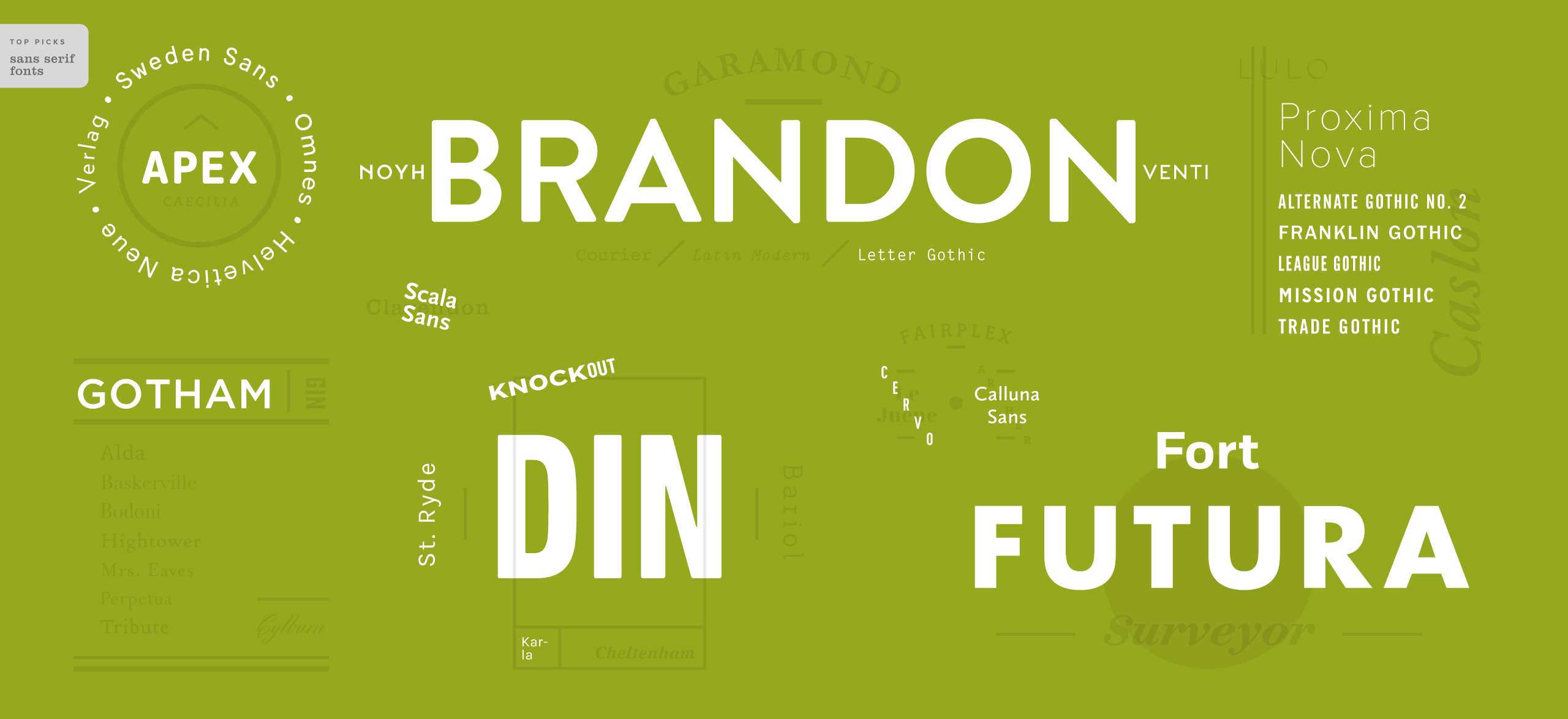
The size of each font roughly corresponds to the number of votes it received. Sans serif fonts were heavily favored, with Brandon (Geometric Sans), Din (Grotesque Sans), and Futura (Geometric Sans) topping many of our lists, and a number of other modern standards—like Gotham (Geometric Sans) and Proxima Nova (Geometric/Grotesque Sans)—trailing closely behind. That’s not to say we don’t love our serif fonts: Caslon (Neoclassical Serif) and Garamond (Old Style/Neoclassical, or Transitional Serif) were undeniable favorites. A number of other classic serifs made it onto many of our lists, like Bodoni (Neoclassical), Clarendon (Old Style), and Mrs. Eaves (Old Style/Neoclassical, or Transitional Serif).
Here’s a breakdown of our top picks by classification:
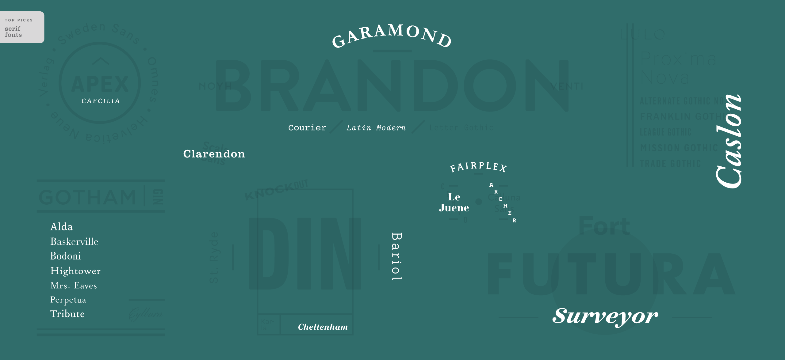
There was a noticeable trend toward narrow, grotesque sans serifs among our selections, in the likeness of Alternate Gothic No. 2 and League Gothic. We listed a handful of monospaced typefaces as well, perhaps signaling a new shift in design evoking the early days of the digital era. (Monospaced fonts are those in which each letterform occupies an equal width, like the font Courier. They can be serif or sans serif, and are often associated with typewriters or early computers, giving them both nostalgic and utilitarian qualities.)
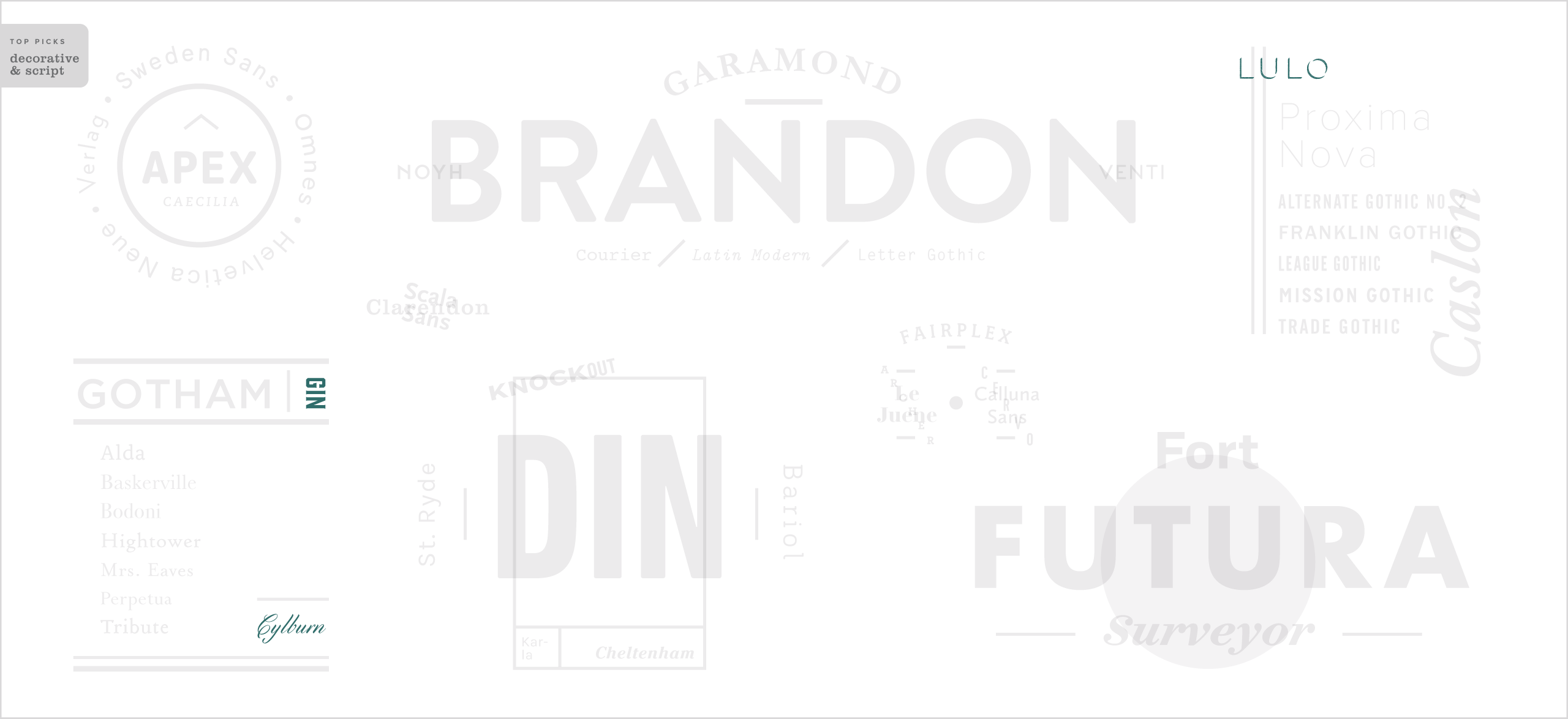
Even though there are more and more full-bodied scripts that include ligatures and flourishes for maximal effect, only one script made our list: Cylburn. There are instances where scripts work well, but each project has different requirements. A few years back when Jessica Hische’s buttermilk came out, we ached to use it—but each time we tried, it didn’t feel right for the application. Often when we do find a script that works, we have to tweak a letter here or there to make it shine.
The other side of this category, decorative fonts, were almost equally as rare a pick. Only Lulo and Gin made the cut (though Lulo was ranked higher than many in the serif and sans serif classes).

There was much more variety throughout the overall selections than we had anticipated, with nearly every category in the typographic universe represented. The designers at Cricket seem to collectively favor the geometric and grotesque sans serif, especially those which for decades have served as models for well-designed type (Futura was designed in 1927; DIN in 1931; Alternate Gothic in 1903). With much of today’s design needing to exist and communicate across both print and digital platforms, this makes sense: it has long been said that sans-serif fonts render much more clearly on screen. But digital rendering of type has vastly improved in recent years, and now sans-serif fonts, even those with high contrast and subtle details, look more crisp on screen than ever before.
So what will our list look like next year? Who knows. Many of the fonts on our list of favorites are here to stay: solid friends who’ve earned their place because they are flexible, legible, and able to change their character to fit into any situation with grace and ease.
As we peer into our crystal ball in the year ahead for typography, we see distressed type beginning to look a bit old and tired. There’s a building trend of thin bold and quirky serifs with curves playing against sharp points. There’s a sense of nostalgia in some newer faces such as Canela Domaine Display and Noe Display, alongside a reemergence of ITC Tiffany, Caslon Bold, and Windsor (hello, the Seventies called and they’d like their type back). We believe this trend will come into full bloom in 2017. Strong geometric, clean type with an almost Swiss sensibility will endure in the new year. We also believe that we’re at a tipping point of the DIY where hand-drawn calligraphic-looking fonts don’t feel so fresh anymore. What will replace that, only time will tell.
How will having a gold throne in the White House change tastes? Will American designers hunger for something more restrained and geometric, reminiscent of the Bauhaus era, or will there be more of a gritty protest vibe at work? We’re eager to see what lies ahead.
Type Has a Type: The Basics of Typeface Classification
Typefaces are generally classified into one of four groups, and within each of those are
a number of sub-groups. For the purposes of this article, we’ll focus on the most common of these sub-groups.
Serif
A serif is a small flourish attached to the end of a stroke on a letterform. With origins in calligraphic writing, serifs can be seen as classic and elegant, and are often considered easier to read than sans serifs in large blocks of body text.
Old Style Serifs

This category includes the first Roman types, originally created between the late 15th
and mid 18th centuries, as well as typefaces patterned after those designed in this period. There is usually little contrast in character stroke weight: hairlines (the thinner strokes within a letterform) tend to be on the heavy side.
Neoclassical (or Modern) Serifs

These are typefaces created within the late 18th century, or their direct descendants. Contrast between thick and thin strokes is abrupt and dramatic. In many cases, stroke terminals (end points) are “ball” shapes rather than an evocation of a broad pen effect.
Slab Serifs

These typefaces became popular in the 19th century for advertising display. They have very heavy serifs equal in stroke weight to that of the letterform. To many readers, slab serif styles look like sans serif designs with the simple addition of heavy (stroke weight) serifs.
Sans Serif
A letterform without small flourishes, or serifs, attached to the end of a stroke. Serifs are often considered modern or minimalist, and are frequently used for body text on the web.
Grotesque Sans Serifs

These are the first commercially popular sans serif typefaces. There is a slight “squared” quality to many of the curves, and several designs have the “bowl and loop” lowercase g common to Roman types.
Geometric Sans Serifs

Simple geometric shapes influence the construction of these typefaces. Strokes have the appearance of being strict monolines and character shapes are made up of geometric forms. Geometric sans tend to be less legible than grotesques.
Humanist Sans Serifs

These are based on the proportions of Roman inscriptional letters. Frequently, contrast in stroke weight is readily apparent. Humanistic sans serif typefaces usually mirror the design characteristics and proportions of serif typefaces, often with a strong calligraphic influence.
Script

Script typefaces are based upon the varied, fluid stroke created by handwriting. They can be organized into formal types similar to calligraphy or cursive writing, or casual types as in less formal, active handwriting.
Decorative