A recent discussion about Website Sameness™ got me wondering if uniformity in web design is really such a bad thing. As much as we strive to design sites that are interesting and feel distinctive, there must be some benefit to homogeneity when it comes to making things usable for a large group of people. I started thinking about other objects I use on a daily basis, and realized that I’m surprisingly grateful for almost every form of sameness in products.
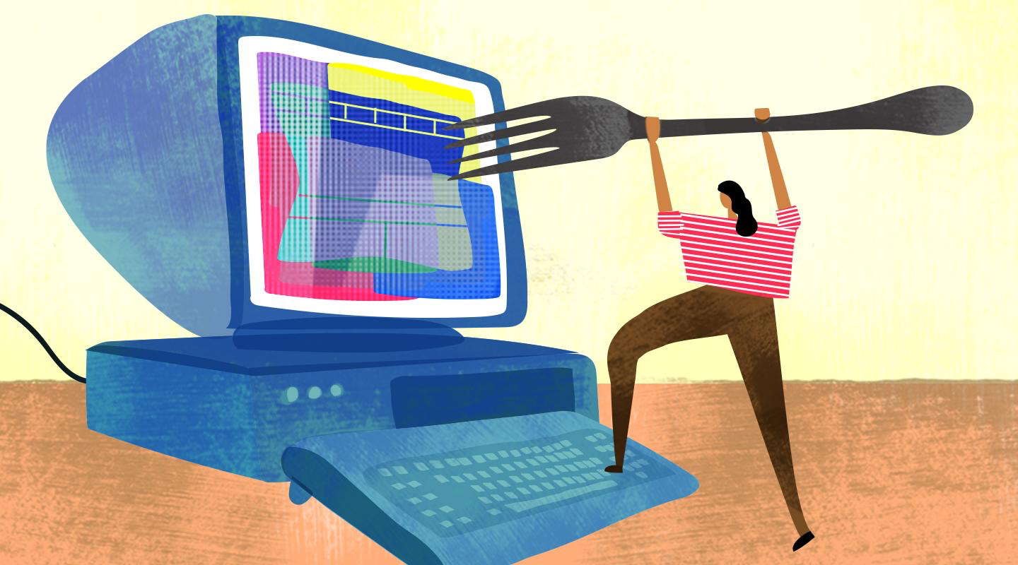
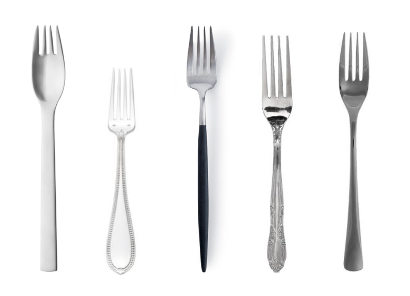
Thanks to Fork Sameness™, I can eat at almost any restaurant in the world and not worry about spilling roasted beet salad all over my lap. Thanks to Washing Machine Sameness™, if I do happen to spill that salad, it won’t be that hard to clean my pants. And thanks to Clothing Sameness™, when those pants are in the wash I can put on another pair with minimal difficulty.
One of the main culprits behind website sameness is the paradigm of a horizontal navigation menu at the very top of the page, followed by a big beautiful photo below it, usually overlaid with a concise brand statement.
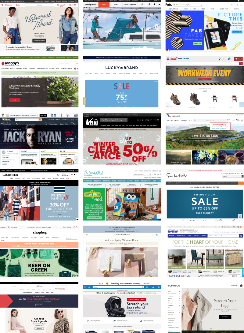
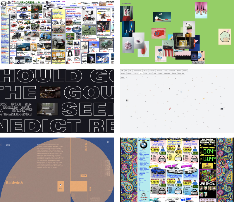
This paradigm is increasingly becoming the norm and contributing to “sameness” on the web, but it does serve an important purpose: to orient visitors and provide them with a clear understanding of where everything lives on a website. Imagine trying to buy a specific product or sign up for a class on a website with a more unusual or overwhelming navigational paradigm:
It would be like trying to eat a salad with one of these forks:
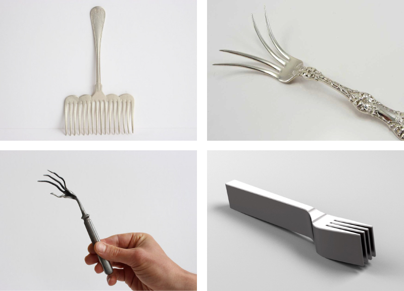
Yes, you could eventually do it after you figure out how to hold it and aim the prongs the right way, but it would require more time and cognitive work – two things that we normally try to avoid when designing websites.
The uniqueness in a website should come from the additional design elements that make the brand itself unique (typography, photography, color palette, illustration and voice), but not the way information is structured and presented. Pushing it further, web-specific elements like scrolling style and animations can be used to enhance the experience in a way that doesn’t detract from the structure of the information.
Ultimately I think there has to be some blurry meeting point where form and function marry and result in a truly useful, pleasing, and if we’re lucky, novel experience. There’s always that one fork you come across with a perfectly-weighted handle and well-contoured tines that enhances the entire eating experience. Its primary purpose is strengthened, not hindered by its design details. Perhaps this is what we should strive for in web design.