Now that 2017 is officially behind us, we look back and reflect on the great work created at Cricket Design Works. We are so thankful for all our clients and the great work opportunities they brought to the studio. We gathered a list of our faves. Take a look!
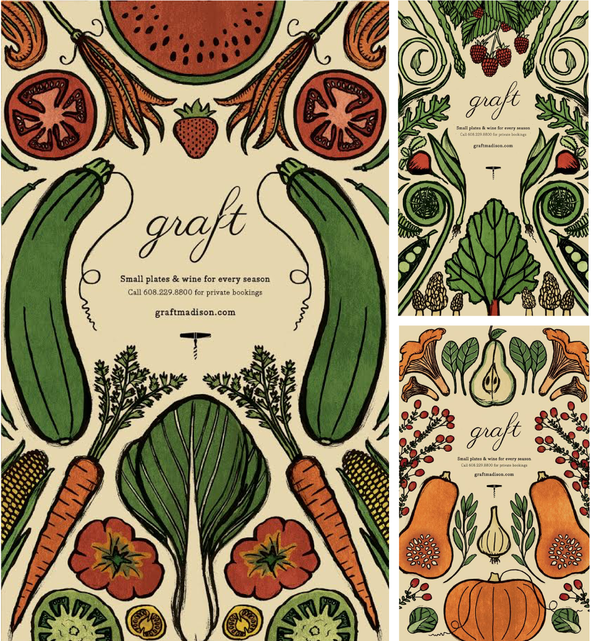
“One of my favorite projects of the year was a series of seasonal posters for Graft. It was a fun opportunity to create hand-made illustrations and explore the wide variety of fruits and vegetables that grow in Wisconsin through the year. Given that I love eating at Graft and always enjoy taking a break from the computer screen, it was delightful to work on.” – Michael
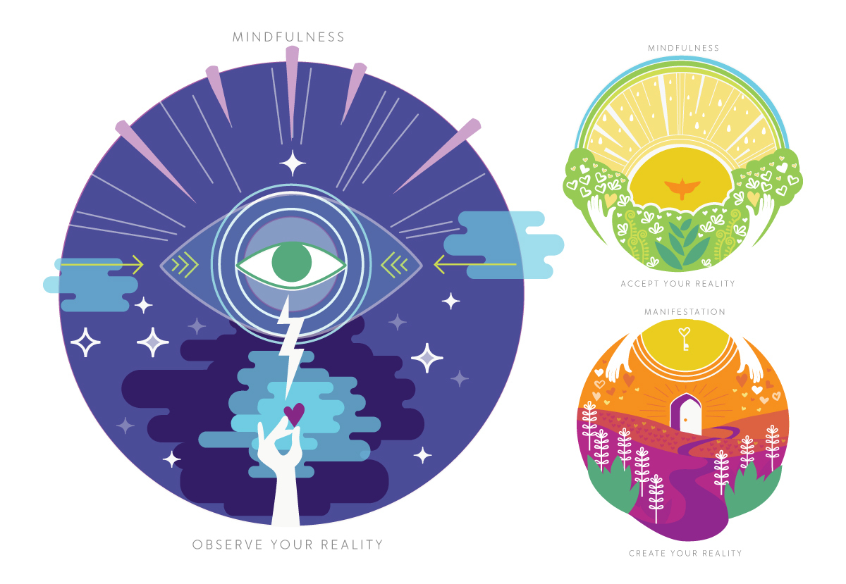
“Meditation is something I've always struggled with. I spent about 4 years wondering if I was doing it right. Earlier this year we helped Breathe For Change (B4C) a national program that runs 200-hr teacher training programs specifically for educators, with the lofty goal to change the world one teacher at a time. As part of that work I got to illustrate the elements of meditation and It was super fun because I rarely get that type of opportunity and because the B4C approach really answered so many of my questions about how meditation works with the neuroscientific approach to how we perceive the world. They're a great organization and our collaboration has been really rewarding.“ – Cricket
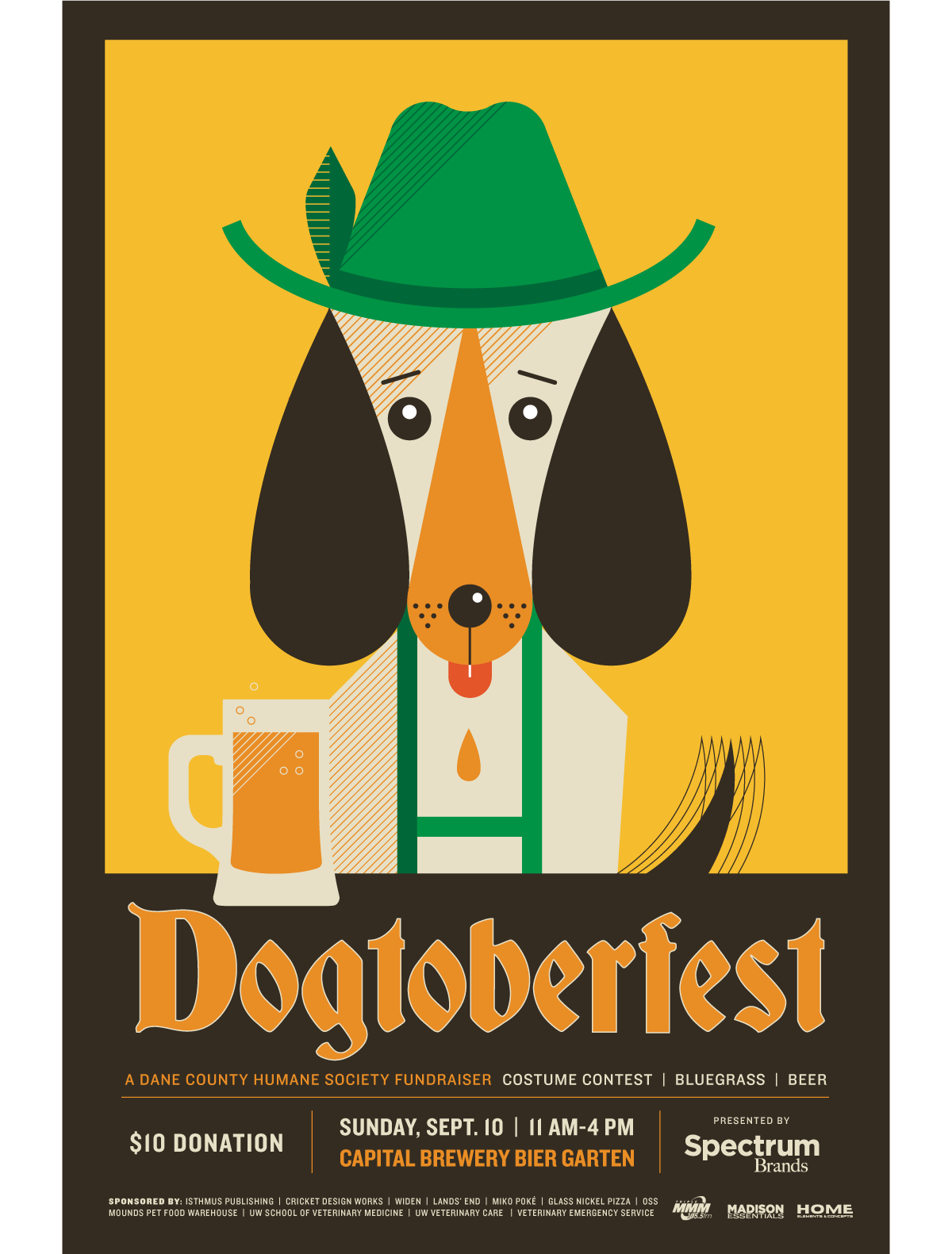
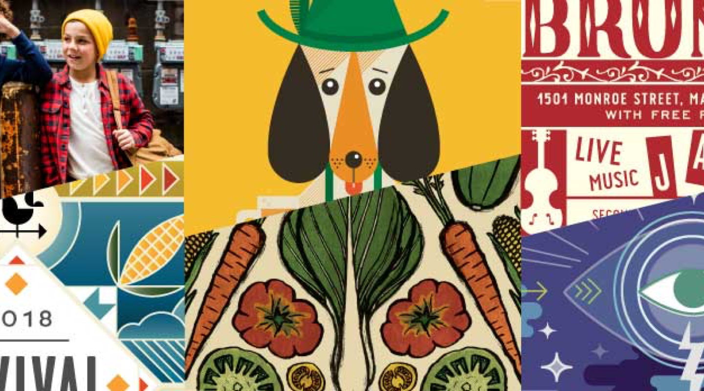
“Dogs! Beer! Two of my favorite things! I took this opportunity to channel another one of my favorites, Charley Harper, to create this illustration for the Dane County Humane Society.” – Bethany
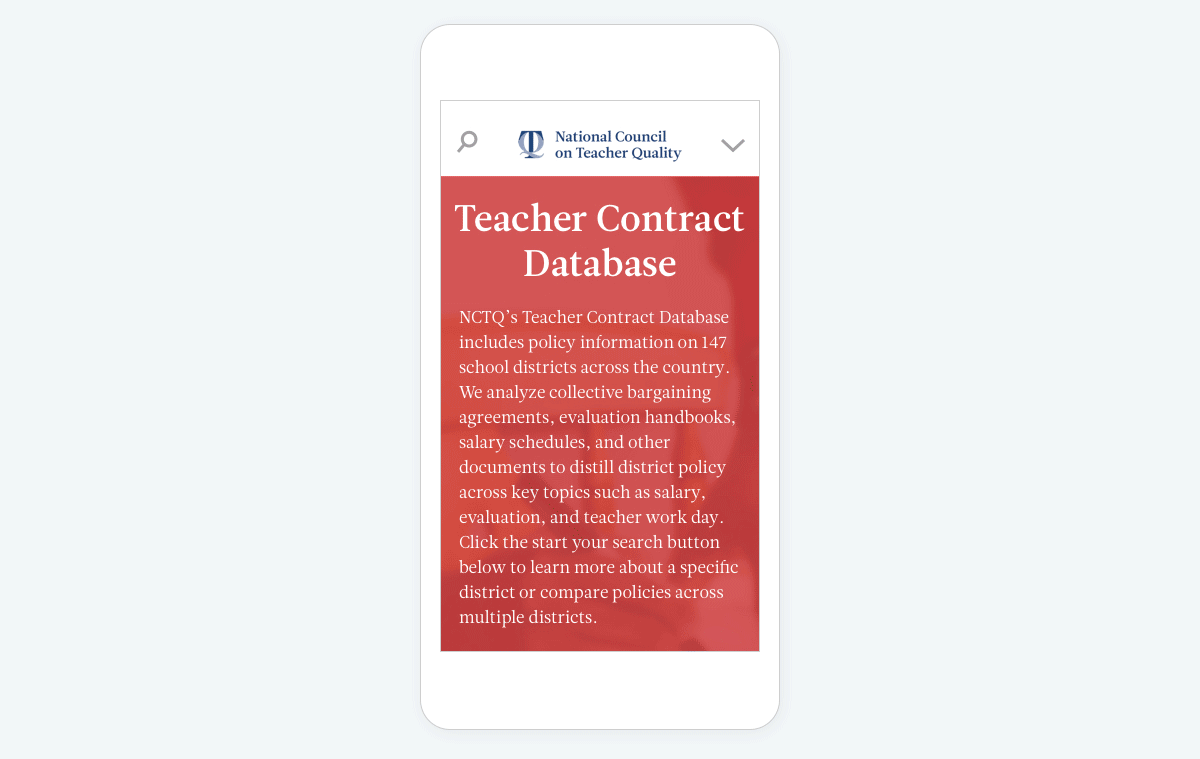
“My favorite project of 2017 is the redesign of the National Council on Teacher Quality’s website. It was a complete overhaul of how they present their vast databases to the world. Throughout the project, the NCTQ folks were very collaborative and open to new ideas for their site’s user experience. With any large site redesign, there were challenges and learning experiences along the way which I was excited to solve. The image above shows you a little piece of UX for their Teacher Contract Database.” – Tessa
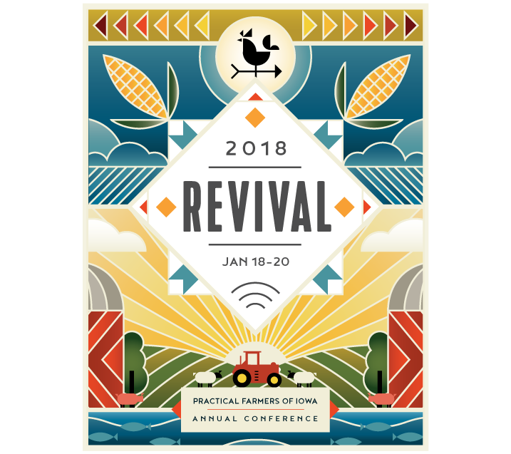
“This project especially shines for me because it reflects two of my favorite facets being a designer: illustration and good old-fashioned collaboration. It was a very rewarding experience to concept and design the conference cover to reflect the year's theme, and then pass it to Tracy with her keen design eye, and go back and forth with her to have an end result that the client and we were super proud of.” – Christina
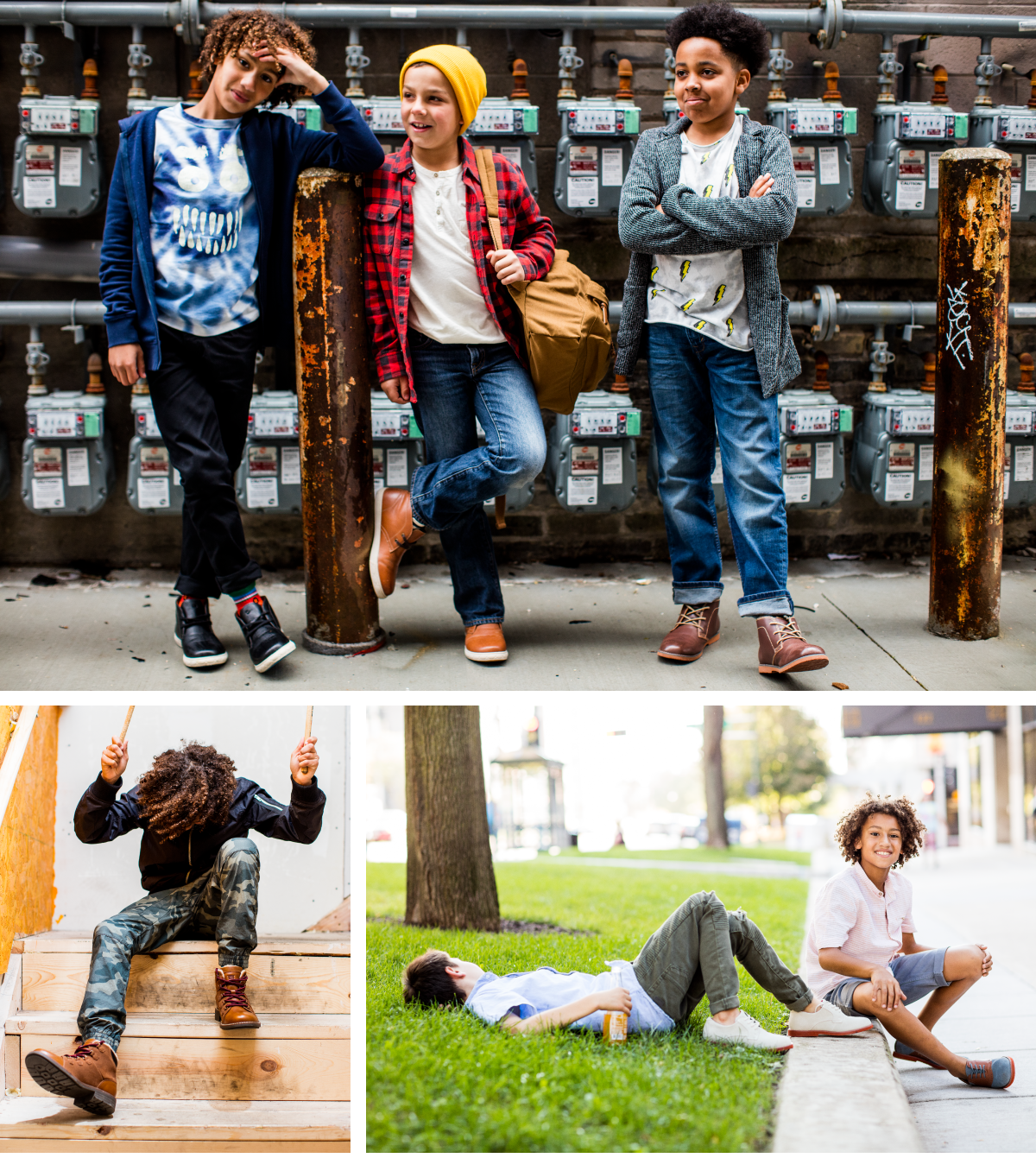
“Florsheim Kids shoots are always an adventure. You never quite know how the day will go, and the excitement builds until the moment you see the final photos. Part of the fun of these shoots is being able to think from the perspective of a kid, while still ensuring that things stay professional. This year's shoot was a blast to work on – the kids were fun and eager, the outfits were on point, and the entire photography crew came with enthusiasm and good ideas. This year was also the first time we shot in Milwaukee, which expanded the territory we're familiar with and provided a lot more urban scenery than we normally have access too.” – Michael
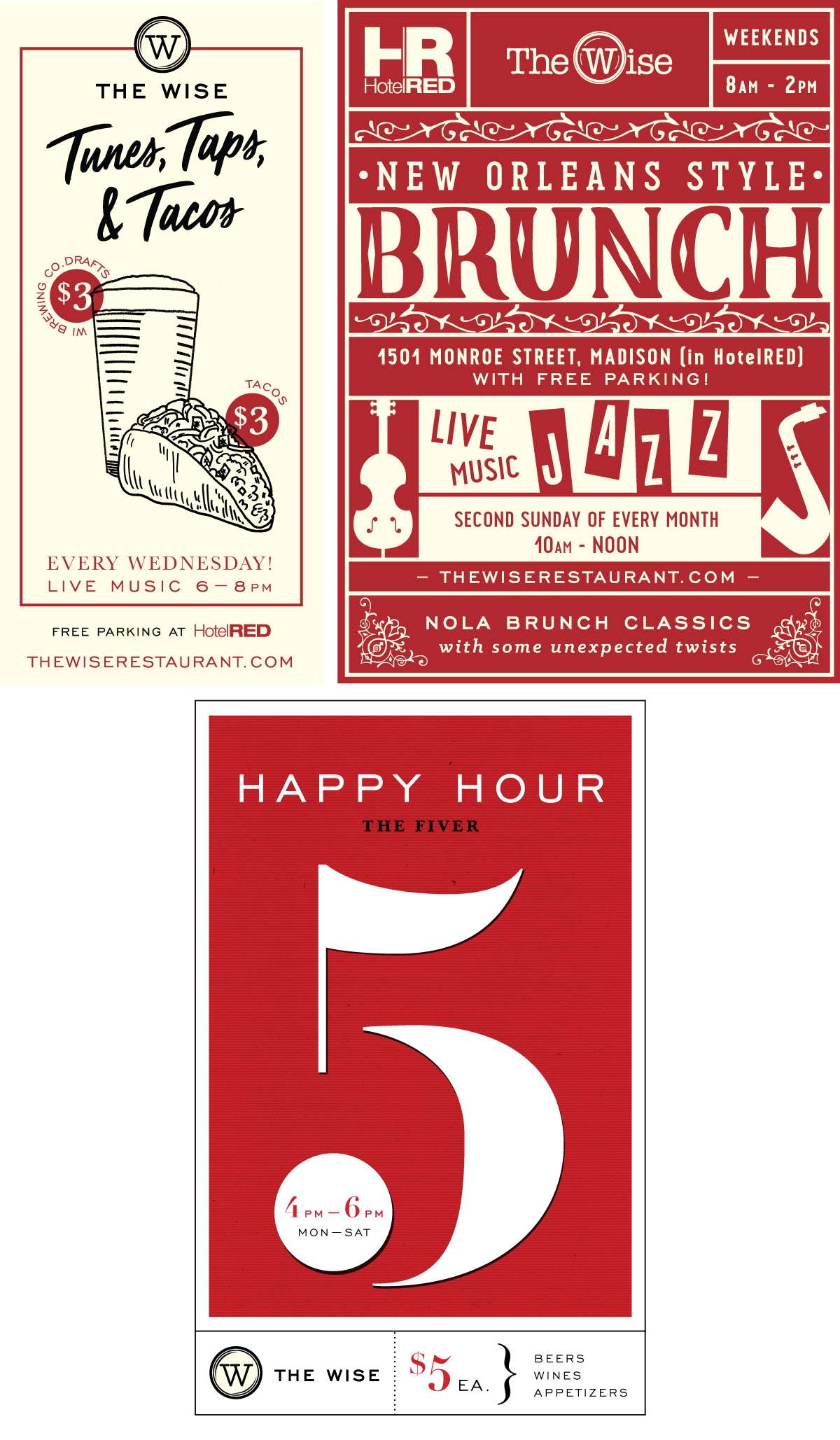
“One of my favorite projects this past year was a series of outdoor signs I illustrated and designed for HotelRED's restaurant, The Wise. I loved the liberation of creating posters that promoted such different events, so they all take on very different looks, all while staying within the restaurant's established brand.“ – Christina
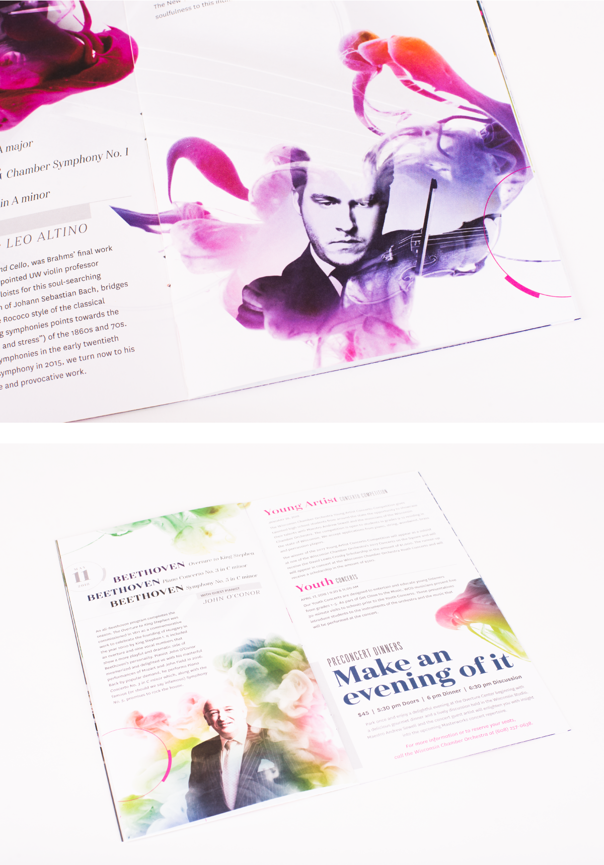
“The Wisconsin Chamber Orchestra season materials are always fun to work on, and yet again it was my favorite in 2017. It's always a challenge to find a way to express music in a new visual way, while keeping it fresh and contemporary. I had a ton of fun working with ink and images to create this year's aesthetic.“ – Tracy
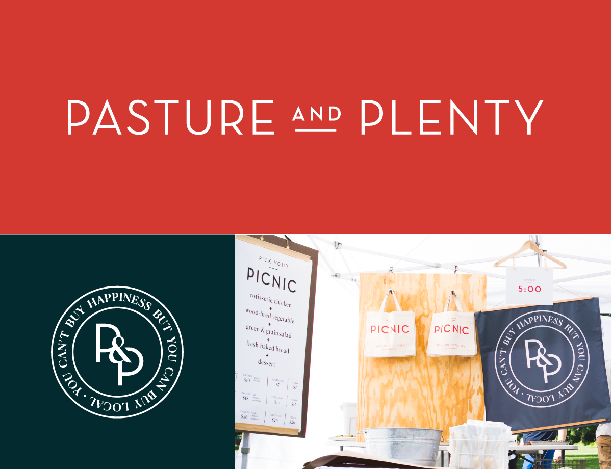
“One of my favorite projects that I worked on this year (in addition to the holiday illustrations, which you can see right now on Instagram and Facebook!) was the Pasture & Plenty branding. I had great fun with the research and preliminary design phase, in which we got to discover what this new business is about, what sets their brand apart, and how to represent their unique voice through their visual identity. Even though my design concepts ultimately were not chosen, it was a great learning experience and opportunity to hone my logo & identity design chops, which is always my favorite type of project!“ – Dana
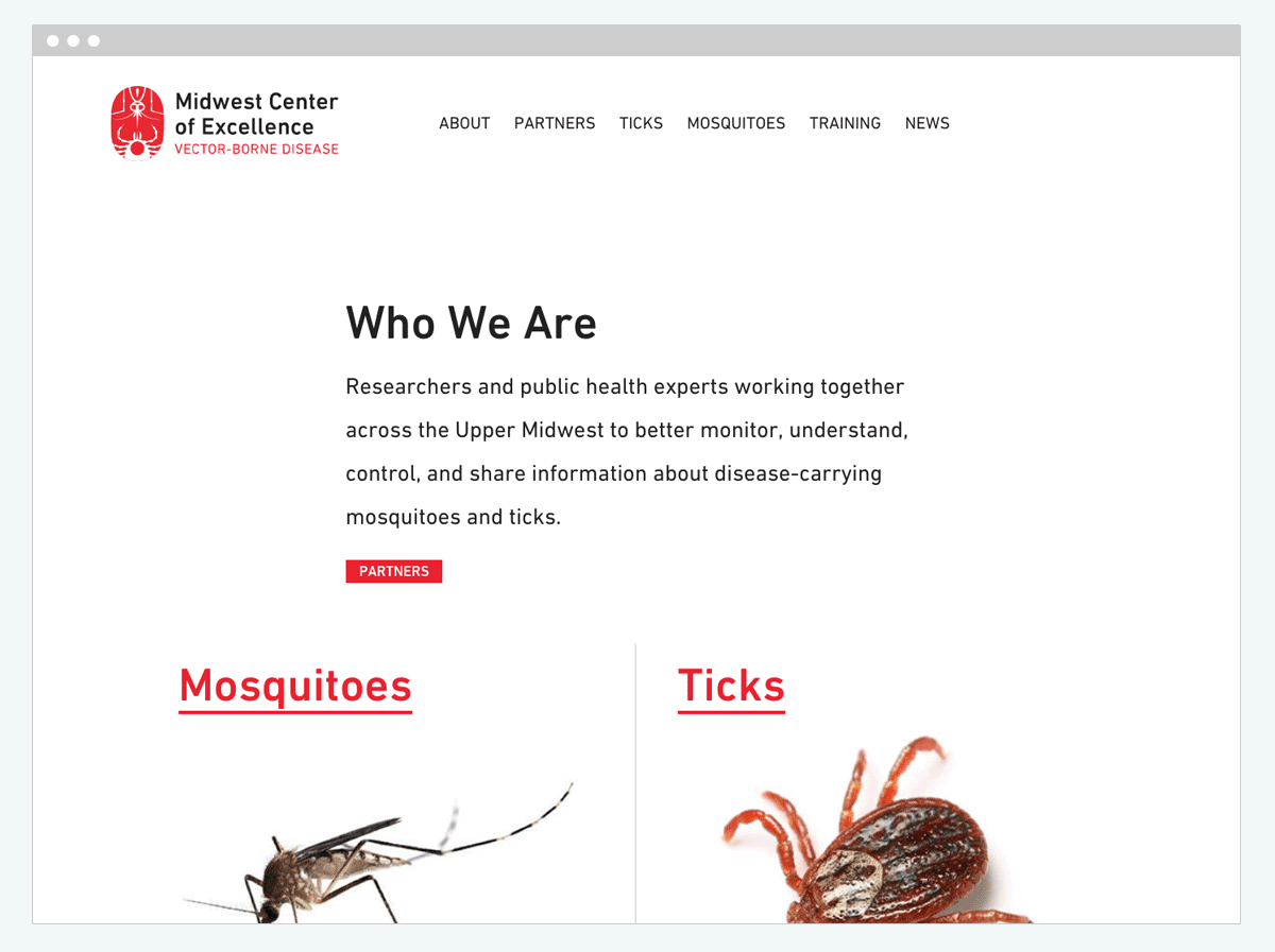
“I really enjoyed working on the Midwest Center of Excellence Vector-Borne Disease website this year. The deceptively simple design allows the images of mosquitoes and ticks to take center stage; how great is that!?“ – Phil